Hello, I got 2 collapsible content on my website, one in the main page and the other one on the “stockists” page.
They are the good size on mobile but I would like to make them wider on desktop ( in order for it to almost reach the border of the screen like it is on mobile).
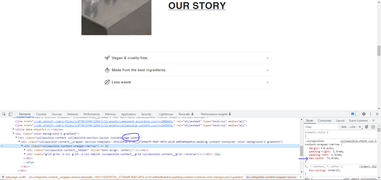
Please find the photo attached.
Shop link : https://0e0f82.myshopify.com/
Thanks in advance guys 
Hi @GadVenin ,
You can do this just by removing the page-width class and some css code, see attached below
If it works, don’t forget to like it and Mark it as Solution!
@GadVenin add below css into base.css file
@media (min-width:768px)
{
.collapsible-content-wrapper-narrow {
    margin: 0 auto;
    padding-right: 1.5rem;
    padding-left: 1.5rem;
    max-width: 155.4rem !important;
}
.page-width {
    max-width: 100% !important;
}
}