I am currently using Supply Theme, but I’m customizing Dawn Theme to switch to soon. My question is how do I go from 4 products to 5 products per row? I currently have 5 on my Supply but Dawn either offers 4 or 6…and if you choose 6, it puts 4 on 1 line and 2 on a line underneath the top line.
Thank you for getting back to me, but my url is for my current website. I am in the custom stage of switching over to Dawn theme. My website is www.reelfishyapparel.com
You’ll be able to see my current Home Page with the 5 images in 1 row, but see the screen shots I provided for what I want to change in the Dawn Theme.. I want 5 photo images across 1 row. Currently Dawn theme only gives me the option of 4 images per row.
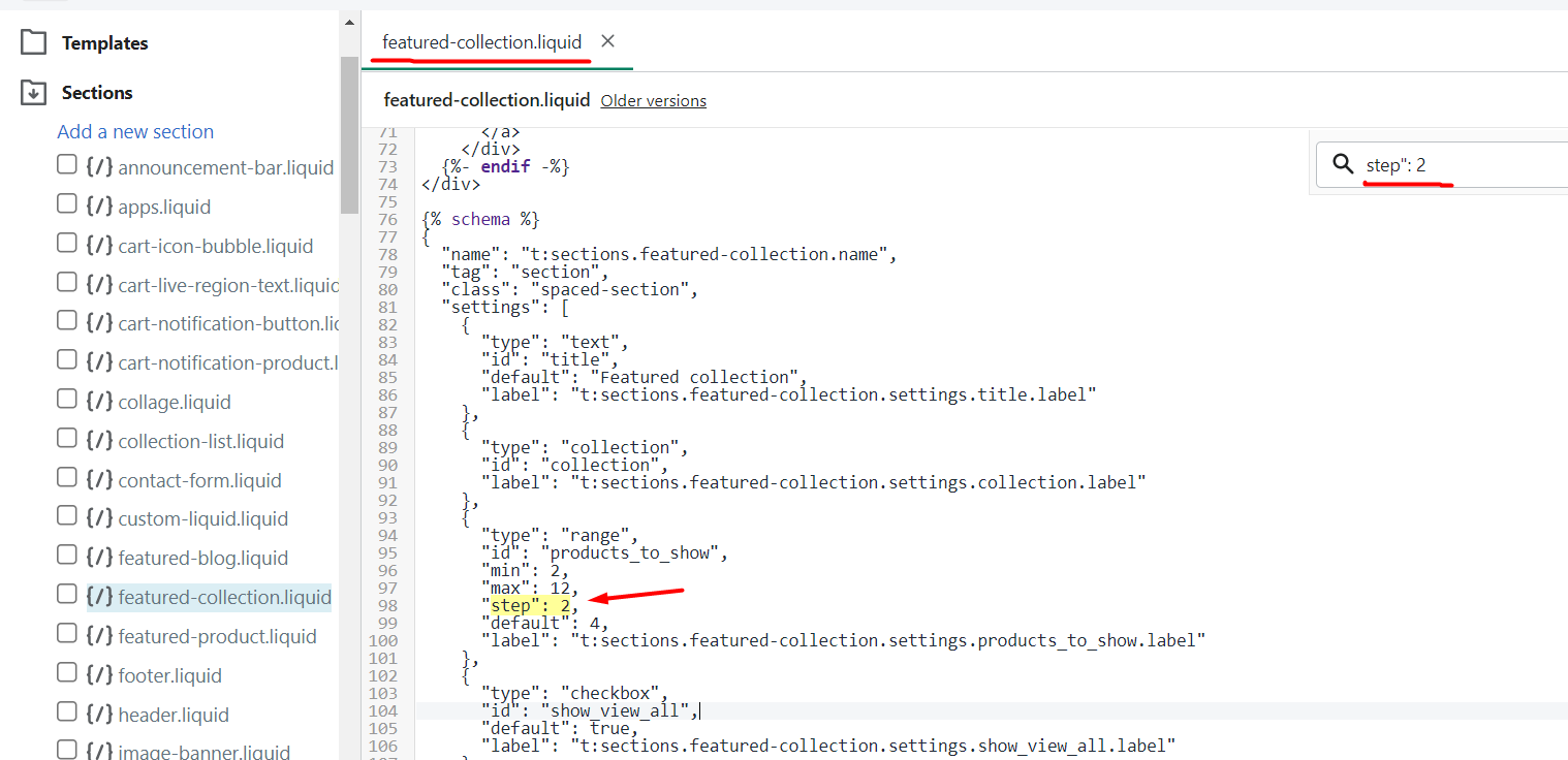
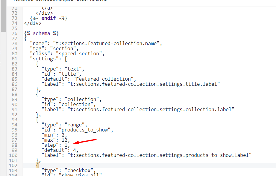
Hi Diego, that does help by putting 5 images on a row, but my maximum products to show only allows me to select 4, 6, 8, 10, etc. It doesn’t allow me to choose only 5. Therefore if I choose max 6, the 5 images are on 1 row, but the 6th is on the 2nd row. I only want 5 images on 1 row. See screen shots. Thanks!
Ok, so that gets me to be able to select 5 as the maximum products to show, but it now shows 3 on 1 line and the other 2 on another line. And the 2 on the second line are huge!
I’m trying to have this to work as well, except i want to always have 3 products displayed in a row, both horizontally and vertically on mobile and ipad.
just like OP i managed to change the number of items in the list, thanks to your code, but now items are displayed onto two lines
Ok, so that gets me to be able to select 5 as the maximum products to show, but it now shows 3 on 1 line and the other 2 on another line. And the 2 on the second line are huge!
@diego_ezfy I had the same issue and found your answer on this thread, and it’s working great! (I set the percentage to 16% to display 6 products per row.)
The only problem I’m running into is how to get it to adjust on tablet and mobile. I’d like it to change to 2 or 3 products per row on mobile, and I can’t figure out how to do that. Any advice would be appreciated!
@LaDolce - any resolution on mobile products shown? I also changed mine on desktop like you suggested and put 6 images vs 5 images and it works fine. Currently on my mobile view, I have 2 pictures per row. I think 3 would be good. Please let me know if you find the solution! Thanks!
@reelfishy I can’t even get 2 images per row on mobile. My mobile view was squishing all six of the products together so that text was overlapping and unreadable. I replaced all the Shopify code with the Searchanize plugin and it’s working better and giving me more options.
@diego_ezfy I tried making both changes you outlined in your response, but am still unable to get five images to show up in one line for the featured collection on the home page - It is still three smaller images and two large images below. Any suggestions on how to correct this?

