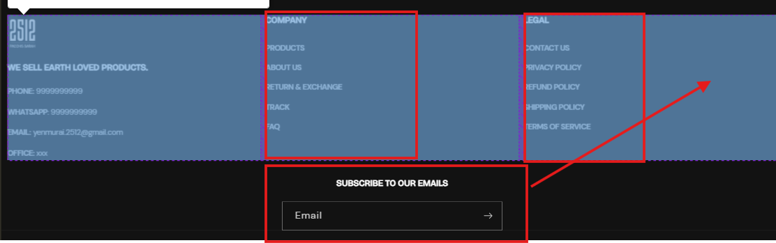
I want to reduce the width of dawn theme footer column width and make the newsletter in same row
website: https://dcd3ls51spg6l4nc-73415852291.shopifypreview.com
password: 2512
Thanks in advance
A user seeks to reduce the footer column widths in Shopify’s Dawn theme and align the newsletter signup in the same row as other footer elements.
Current Issue:
Proposed Solutions:
Two community members provided CSS-based fixes, both requiring edits to base.css via the theme code editor:
Solution 1: Uses flexbox with percentage-based widths
flex-wrap for responsive behaviorSolution 2: Uses media query for desktop screens (991px+)
display: flex on parent container to align items horizontallyBoth approaches modify the Dawn theme’s default footer layout through custom CSS. The discussion remains open with no confirmation of which solution was implemented.
I want to reduce the width of dawn theme footer column width and make the newsletter in same row
website: https://dcd3ls51spg6l4nc-73415852291.shopifypreview.com
password: 2512
Thanks in advance
hi @Sivadarshan
To reduce the footer column width in the Dawn theme and place the newsletter in the same row, you can adjust the CSS:
.footer__blocks {
    display: flex;
    flex-wrap: wrap;
    justify-content: space-between;
}

.footer__block {
    flex: 1 1 20%; /* Adjust width as needed */
}

.footer__newsletter {
    flex: 1 1 30%; /* Adjust width to align in the same row */
}
This should help reduce column width and align the newsletter
Hello @Sivadarshan
Please follow the steps below after logging into the Shopify admin:
Go to your Shopify Admin panel.
Click on Online Store > Themes.
Find the theme you want to edit and then click Actions > Edit code.
Search base.css
Insert the provided CSS code at the end of the file and save the changes.
@media screen and (min-width: 991px)
{
.footer .footer__blocks-wrapper
{
    width: 75%;
}
.footer .footer-block--newsletter
{
    width: 25%;
    margin-top: 0;
}
.footer .footer__content-top
{
    display: flex;
    align-items: flex-start;
}
}
Please hit Like and Mark it as a Solution if you find our reply helpful.