I’m using the Dawn theme for my store. I want to customize the mobile view header because the logo, hamburger menu and other icons are not in alignment, please help me to align in center and searchbar is taking too much space in top, please help me to reduce the top padding or margin whatever.
Website: https://jdegrct60tbhc6fv-93050175853.shopifypreview.com
password: amber
Hi @Sivadarshan
Let’s go to your Admin → Sale Channels → Online Stores → click to edit code your theme.
Then find the file base.css and add this code to the botom of that file:
@media (max-width: 990px) {
  header.header {
    align-items: flex-start;
  }
  .header__heading .header__heading-link {
    padding: 0;
  }
  .header-wrapper .CustomHeaderSearch--mobile {
    margin-top: 0;
    padding-bottom: 5px;
  }
}
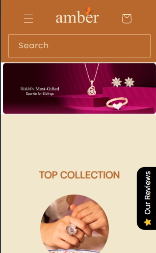
The result will be:
Hi @Sivadarshan,
Thanks for your porsting here!
I understand you’re having trouble with the mobile header alignment on the Dawn theme. Here’s a quick fix.
- From your Shopify admin, go to Online Store > Themes. On your Dawn theme, click Actions > Edit code.
- In the Assets folder, find and click on
base.css.
- Scroll to the very bottom of the file and paste the following code:
@media (max-width: 990px) {
  .header {
    align-items: end !important;
  }
  .header__icon--menu {
    height: 2rem !important;
    margin-bottom: .75rem !important;
  }
  .header__icons {
    padding-bottom: .75rem !important;
  }
  .header__icon--account {
    height: 2rem !important;
  }
  .header__icon--cart {
    height: 2rem !important;
  }
   .CustomHeaderSearch--mobile {
    margin-top: 8px !important;
  }
}
- Click Save. After applying this change, your mobile header will be clean and perfectly centered. I hope this is the result you are looking for:
Hope it helps! Let me know if you have any further questions.
Hi
- Go to Online Store → Theme → Edit code.
- Open your theme.css / based.css file and paste the code in the bottom of the file.
@media(max-width:990px){
.header {
    align-items: self-end !important;
}
header.header.header--middle-left.header--mobile-center.page-width.header--has-menu.header--has-account {
    display: flex !important;
    justify-content: space-between!important;
    align-items: self-end!important;
}
header-drawer {
    margin-bottom: -1%!important;
}
 .header__icons {
    margin-bottom: -1% !important;
}
    .CustomHeaderSearch--mobile {
        margin-top: 4px !important;
    }
}
}
Result:
If my reply is helpful, kindly click like and mark it as an accepted solution.
Thanks!
Use our Big Bulk Discount app to boost your sales!  ( BBD ‑ Big Bulk Discount - Volume Or Tier Discount - Boost Sales With Discounts | Shopify App Store ). Easy to set up and perfect for attracting more customers with bulk discounts. Try it now and watch your revenue grow!