Hi. Does anyone know how to move the whole hamburger menu from the left to the right? And to open it from the right as well.
My website: https://viellelondon.com
password: 1231231231
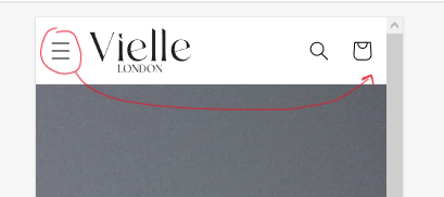
The example:
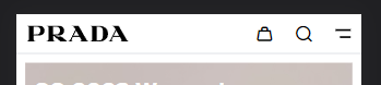
My website header:
Hi. Does anyone know how to move the whole hamburger menu from the left to the right? And to open it from the right as well.
My website: https://viellelondon.com
password: 1231231231
The example:
My website header:
Hello @AndreiGhetu
You can follow these steps:
I hope the above is useful to you.
Kind & Best regards,
GemPages Support Team
Hi. Thank you for your response. Unfortunately, the code didn’t work. It didn’t change the mobile header in any way, but the normal header, in a weird way.
Step 1: Go to Online Store->Theme->Edit code.
Step 2: Search file base.css
Step 3: Paste the below code at bottom of the file → Save
@media (max-width: 989px ) {
          header-drawer {
              order: 2;
              margin-left: 10px;
          }
          .header {
              display: flex;
              justify-content: flex-end;
          }
          .header--mobile-left .header__heading {
              flex: 1;
          }
      }
Thank you ! This worked
This worked for me but how do I make it so my logo stays in the middle
How do I move the logo to left?