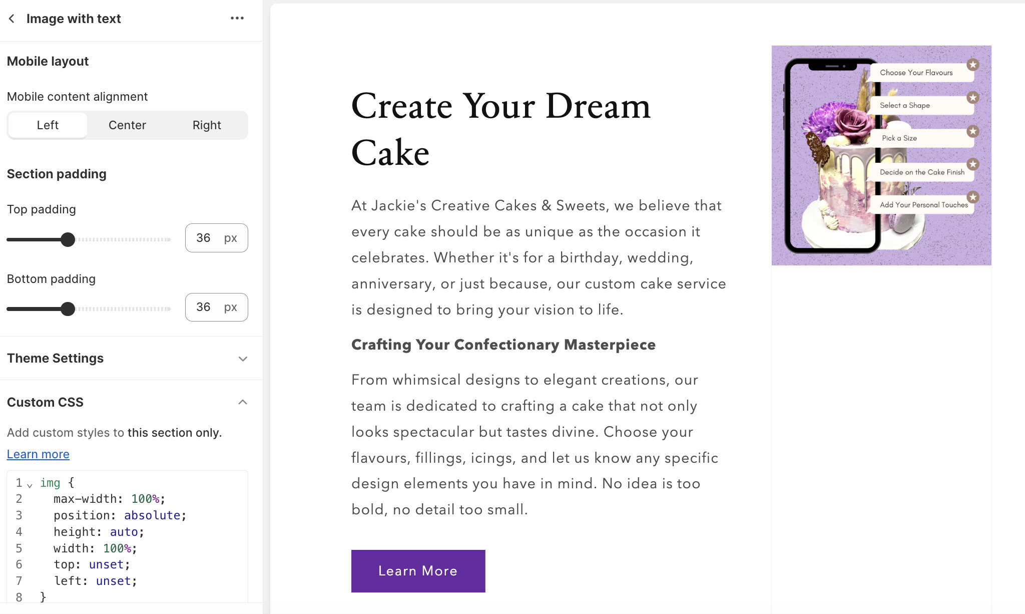
Hello! I am working on a website and am trying to make an image full-width within an image with text section. This is what it looks like right now:
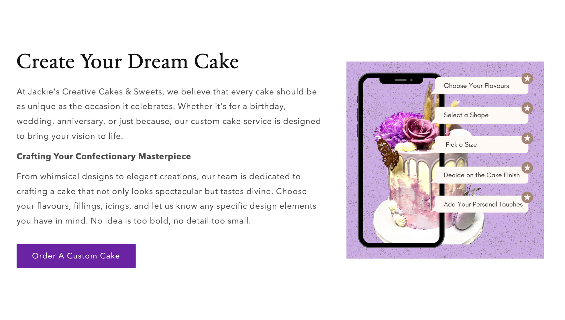
What custom CSS can I add to this section to achieve this result? See the image below:
Here’s the preview link: https://oc0rp5osmmwoh3xv-59803566217.shopifypreview.com
Thank you!
Spac-es
November 16, 2023, 9:21pm
2
1º Add the following code in the component-image-with-text.css (inside the existing code line 312):
display: flex;
    justify-content: center;
    align-items: center;
    border: none;
The code would look like this:
.image-with-text:not(.image-with-text--overlap) .color-background-1, .image-with-text.image-with-text--overlap .image-with-text__media.color-background-1 {
    background: transparent;
    display: flex;
    justify-content: center;
    align-items: center;
    border: none;
}
2º Replace the following code (base.css line 1120):
.media > *:not(.zoom):not(.deferred-media__poster-button),
.media model-viewer {
  display: block;
  max-width: 100%;
  position: absolute;
  top: 0;
  left: 0;
  height: 100%;
  width: 100%;
}
with this other one:
@media (max-width: 999px) {
  .media > *:not(.zoom):not(.deferred-media__poster-button),
  .media model-viewer {
    display: block;
    max-width: 100%;
    position: absolute;
    top: 0;
    left: 0;
    height: 100%;
    width: 100%;
  }
}

@media (min-width: 1000px) {
  .media > *:not(.zoom):not(.deferred-media__poster-button),
  .media model-viewer {
    align-self: center;
    max-width: 100%;
    position: absolute;
    height: auto;
    width: 100%;
  }
}
Result:
I hope it helped you!
Spac-es
November 16, 2023, 9:32pm
3
I forgot to tell you that you must also add additional code in your base.css:
.image-with-text__media {
  padding-bottom: unset !important;
}
Now it should work correctly!
Hello! Thank you so much - The code works for the section, but it somehow broke the hero/banner image on my home page (no hero image appears now, just an empty block). Please see the code I inserted in base.css:
The code also causes the image to disappear in mobile view. How can I fix this?
Is there a way I can add custom CSS code to only the one particular section instead of the theme files?
Spac-es
November 16, 2023, 9:59pm
7
I understand the problem. To solve it DO NOT do the second step of my previous answer (2nd).
Instead of doing that, let’s add the following code to the base.css:
img[src*="Graphic_-_No_Title_-_Cropped_77558007-4807-4ebd-854f-fca57f63a4ca.png"] {
  max-width: 100%;
  position: absolute;
  height: auto;
  width: 100%;
  top: unset;
  left: unset;
}
Spac-es
November 16, 2023, 10:01pm
8
Remember, you must also add this code.
.image-with-text__media {
  padding-bottom: unset !important;
}
I added the code but it didn’t change anything
Spac-es
November 16, 2023, 10:28pm
10
Can you add the link of your image directly in the code? That link I posted is not the correct one. Please go to your store content from admin panel, copy the url of the image and paste it inside the src*=“add-url”
I tried that but still no change:
Spac-es
November 16, 2023, 11:00pm
12
this code will work. is the correct src.
img[src="//oc0rp5osmmwoh3xv-59803566217.shopifypreview.com/cdn/shop/files/Graphic_-_No_Title_-_Cropped_77558007-4807-4ebd-854f-fca57f63a4ca.png?v=1700162482&width=1500"] {
  max-width: 100%;
  position: absolute;
  height: auto;
  width: 100%;
  top: unset;
  left: unset;
}
That code unfortunately didn’t work either (even with the correct src/url). When I inserted the code you provided into custom CSS in the theme editor, I got this result:
This is very close to my desired result, but i want the image to be centred with the text. Could you help? I think it’s easier with adding custom css directly into the section I want to change
Spac-es
November 17, 2023, 11:53pm
14
Perfect! You can add this code in your base.css to center the image:
@media (min-width: 750px) {
  #shopify-section-template--15700249411721__ebdbce96-14b7-44cf-84ac-4e4af39f6dd3 img {
    margin-top: 100px;
  }
}
1 Like


