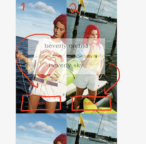
Hello I am trying to achieve a runway looking option for my brands runway page but the buttons are not only weirdly transparent and ugly they only go in the middle and on top of eachother on mobile or side by side on desktop.
I want the buttons to be on their correct side that correlates with the image and to be aligned in the middle of said image at the bottom, I also want the look number at the top left. I want this to be the way this will always work no matter how many i add on this page!
I want the button background to be black but not have so much padding i want only a small rectangle that covers the back of text just enough not this much padding as it is now.
an extra nice feature would be if i could add a maximum of 5 buttons to each image but idk if that’s too much and that is not necessary right now.
My website url is: amelieparis.myshopify.com
the password is: PARIS
please help me out asap
I will like a bunch of your posts, and accept solution!
This may be from the buttons not having links|urls entered so it disables them which is what changes the opacity
Just put something like amelieparis with the hash mark so it stays on the page
Also the button text has an excessive amount of “” characters in it for some reason
You’ll want to resolve that first issue before going deeper in the pile of design requirements.
Trying to force the image banner to do all those things may not be best approach you may be better of with a custom section, or designing the html separately for that page unless you intend this to be a template for many many items.
1 Like
Thank you Paul, I have completed what you said, how could I fix button alignment?
bump! Still in need of a solution, I will like a bunch of your posts and accept as solution!
Hi @comingera ,
You can add the button again, I will check it.
Hi @comingera ,
Please follow these steps:
- Step 1: Go to Online store > Themes > Actions > Edit code.
- Step 2: Go to Assets > section-image-banner.css and paste this at the bottom of the file:
.banner__content{
	max-width: 100% !important;
}
.banner__content .banner__box{
	max-width: 100% !important;
    height: 100% !important;
    width: 100% !important;
}
.banner__box>.banner__buttons{
	position: absolute !important;
    bottom: 0;
    left: 0;
    flex-wrap: nowrap !important;
    justify-content: space-around !important;
    align-items: center !important;
    width: 100% !important;
    padding: 15px !important;
}
.banner__box>.banner__buttons a{
	flex-grow: initial !important;
    line-height: normal !important;
    min-height: auto !important;
    padding: 10px !important;
}
@media screen and (max-width: 749px){
	.banner__box>.banner__buttons a{
		padding: 5px !important;
		font-size: 15px !important;
	}
}
Hope it helps!
1 Like
Amazing, you were fixed it as always! Thank you!
