Dawn theme issues with collection page and a collection list

Hi there, I was hoping for a little bit of help with 2 issues I’m having with the Dawn theme.

Firstly I am trying to move the collection text to the bottom, and I have read a variety of replies here on this topic however I can’t find the collection template in the sections. I have managed to change the text to the bottom on other themes but not on the theme I am actually using because the collection template I’m trying to edit doesn’t seem to the there.

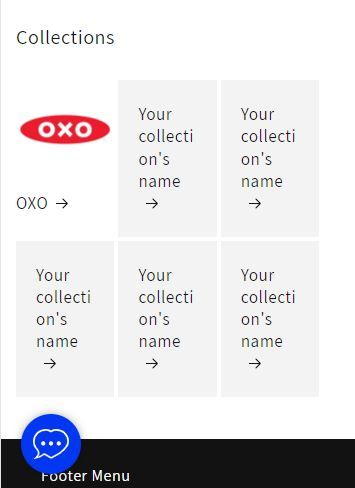
My second issue is the Dawn theme is a little ugly in mobile view as it only shows the collection list in one single column. I would like to have 2 columns for the collection list on mobile view only. I would like to leave it as it is on desktop view etc.

thanks in advance

2 Likes

@toymac

Sorry you are facing this issue, it would be my pleasure to help you.

Welcome to the Shopify community! :blush:
Thanks for your good question.

Please share your site URL,
I will check out the issue and provide you a solution here.

Thank you, url is toy-shed-ireland.myshopify.com

1 Like

@toymac

yes, please try this code

  1. Go to Online Store->Theme->Edit code
  2. Asset->/section-collection-list.css ->paste below code at the bottom of the file.
@media screen and (max-width: 749px) {
.collection-list .collection-list__item {
    width: calc(50% - 3rem);
}
}

Hi, thank you for your reply. I have just tried your suggestion and unfortunately it does not make any changes. Thank you for the response though

Hi there,

I had the same problem and I have tried your solution and now I have two items in one column in mobile view, so I see it as solved. Thank you very much!

Hi. This worked for me with the mobile view.

How can I add columns for more collections on my home page in desktop view?

@Iceman555

can you please share store url

@KetanKumar

@Iceman555

now i can 6 collection block do you need more right?

I need more columns. I would like to have 4-5 collections in each row.

:white_medium_square: :white_medium_square: :white_medium_square: :white_medium_square: :white_medium_square:

:white_medium_square: :white_medium_square: :white_medium_square: :white_medium_square: :white_medium_square:

@Iceman555

yes, please try this code

  1. Go to Online Store->Theme->Edit code
  2. Asset->/section-collection-list.css->paste below code at the bottom of the file.
@media screen and (min-width: 750px) {
.collection-list.grid--3-col-tablet .grid__item {
    max-width: 25%;
}
}

I am using the Dawn theme but this does not work for me either. Here is the code that I have for the section. Are you able to tell us where we need to insert the code in this section?

.collection-list {
  margin-top: 0;
  margin-bottom: 0;
}

.collection-list-title {
  margin: 0;
}

@media screen and (max-width: 749px) {
  .collection-list:not(.slider) {
    padding-left: 0;
    padding-right: 0;
  }

  .section-collection-list .page-width {
    padding-left: 0;
    padding-right: 0;
  }

  .section-collection-list .collection-list:not(.slider) {
    padding-left: 1.5rem;
    padding-right: 1.5rem;
  }
}

.collection-list__item:only-child {
  max-width: 100%;
  width: 100%;
}

@media screen and (max-width: 749px) {
  .slider.collection-list--1-items {
    padding-bottom: 0;
  }
}

@media screen and (min-width: 750px) and (max-width: 989px) {
  .slider.collection-list--1-items,
  .slider.collection-list--2-items,
  .slider.collection-list--3-items,
  .slider.collection-list--4-items {
    padding-bottom: 0;
  }
}

@media screen and (min-width: 750px) {
  .collection-list__item a:hover {
    box-shadow: none;
  }
}

@media screen and (max-width: 989px) {
  .collection-list.slider .collection-list__item {
    max-width: 100%;
  }
}

.collection-list-view-all {
  margin-top: 2rem;
}

@Logius

oh sorry for that can you please share store url

@KetanKumar Thank you for your reply but the theme I’ve mentioned in the post is currently unpublished due to the issue.

Here is our site URL.

@KetanKumar Here is the preview link: https://kitchenequipped.com/?_ab=0&_fd=0&_sc=1

Actually, when I tried again it changed the layout successfully but is there any way I can center align all of the squares so it looks organized on every device?

1 Like

@Logius

yes, please share issue images

@KetanKumar Yes, here it is. No matter how many columns are in a row, I want them to be always center aligned.

Desktop screen shot

Mobile screen shot

1 Like

@Logius

yes i know but i can’'t see that section can you show me

@KetanKumar Not sure what photo you are requesting. Could you please specify what needs to be included in the image?

1 Like