There are 2 issues that need to be addressed, namely:
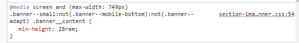
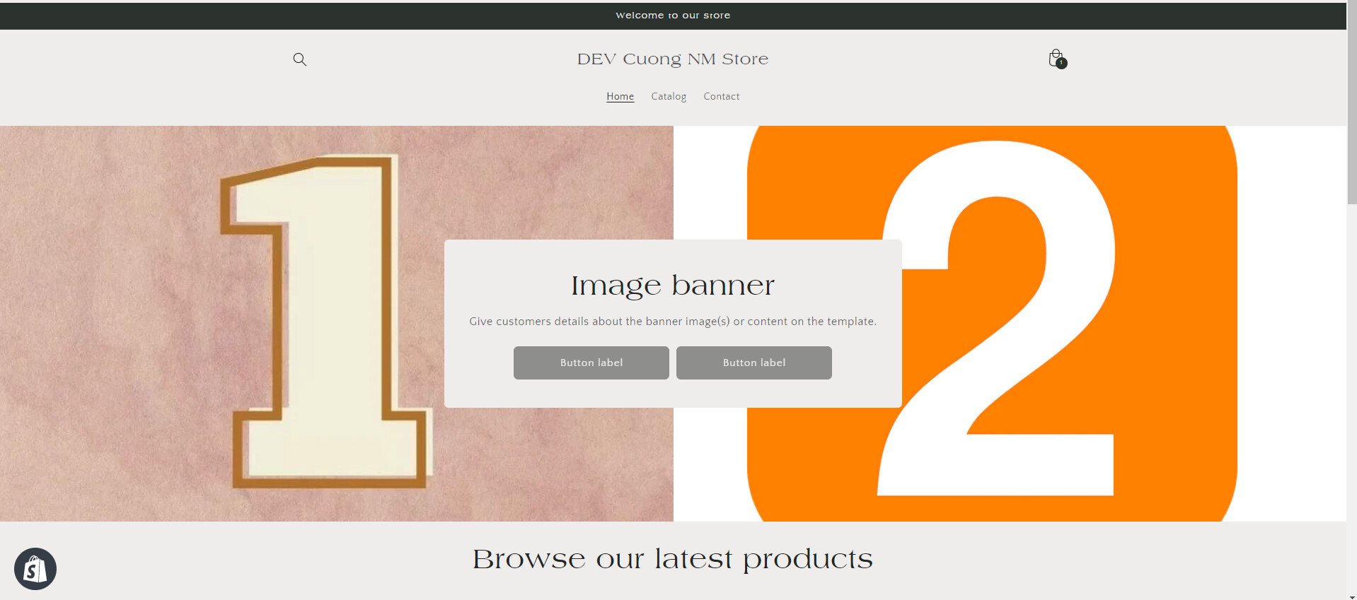
The banner in the home page gets cropped and loses image quality in the mobile version. In your theme code, specifically in the section-image-banner.css file in the assets folder (min-height: 28rem)
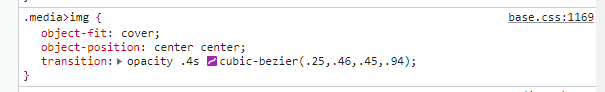
the base.css file in the assets folder (object-fit: cover).
Note that the value “cover” in the object-fit attribute means that the image keeps its aspect ratio and fills the given dimension, but may be clipped to fit. This is what causes the image to be too large and lose quality on mobile devices.
My suggestion for this issue on mobile screens is as follows:
Regarding the issue of image quality degradation when scaling, I can tell you that it is a common occurrence when images are resized, even though the object-fit attribute can minimize it. However, you can do better by:
Using separate product images for desktop and mobile layouts to avoid resizing
Using appropriate image formats for the content and display size of the website. For example, use JPEG format for images with many details and PNG format for transparent or text-containing images.
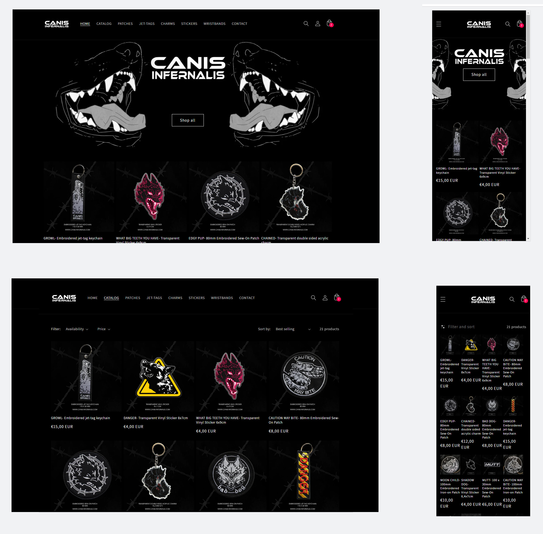
In the catalog and collection pages, the product pictures turn really small on mobile, and the text and prices look unreadable. I noticed that the homepage layout is quite responsive, with the list product layout divided into 4 columns, 3 columns, or 2 columns depending on screen size. However, on the collection page, the layout always remains as 4 columns even when the screen is narrowed, which makes the space for each product too small and makes the image and product information too small to read.
I found the CSS code that causes this issue.
So, if possible, please go to base.css and remove that code. After that, your collection page will change its layout to 3 or 2 columns on smaller screens.
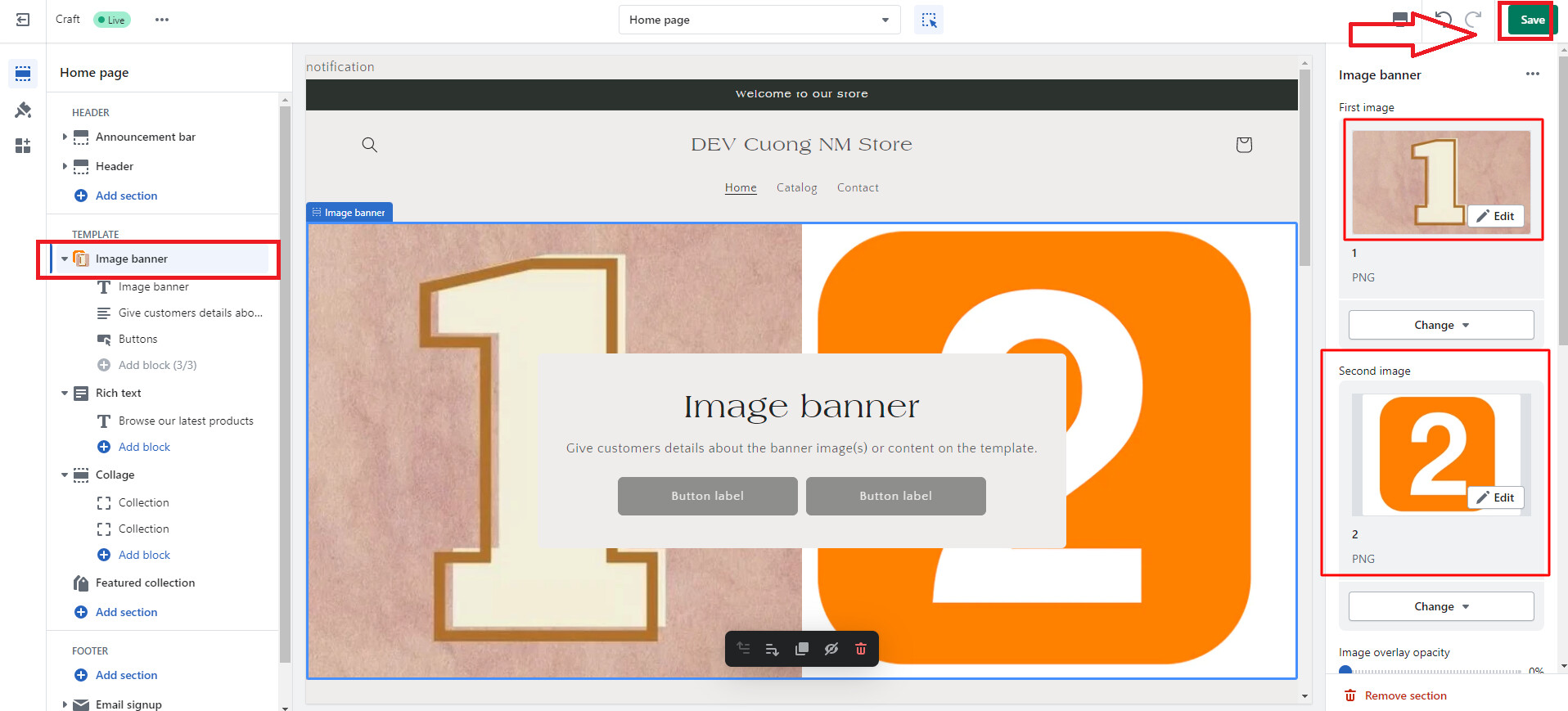
Assuming image #1 is the desktop banner and #2 is the mobile banner image, on each device, only one image will be displayed.
Let’s add some css in theme.css
Assuming image #1 is the desktop banner and #2 is the mobile banner image, on each device, only one image will be displayed.
Let’s add some css in theme.css
Hi @BSS-Commerce we’re also having this problem where the banner is cropped on mobile view.
I cannot seem to find the code to be added here to be able to upload a separate mobile banner. Can you assist? And do you know the acceptable size for mobile banner image? Thank you so much!
hi, i copied the code and pasted at the bottom of base.css file and saved it, refreshed my website and opened it on my mobile, nothing changed. the problem still remained. may i know if there is any other way to downsize the banner image t make it mobile responsive?