Can someone pls provide code to remove the padding on the sides of my desktop nav menu? I want the sides of the nav menu to touch the edge of the screen. In the screenshot I have arrows pointing to the padding I want removed.

Do you have a custom.css in your Assets folder?
If so try this:
.header__inline-menu {width:100%;}
Now however, that the header that your navigation bar is in is NOT 100% wide, so.. it may look good on your end, but on wider screens, it’ll just be as wide as the “width” that your complete header is in.
that didn’t work unfortunately
that didn’t work unfortunately. theme is mentioned in the title.
Hello @milkymotorsport 
Inside Shopify Admin, you can go to Edit theme code, open file base.css and add this code at the bottom
.header__inline-menu {
    width: calc(100% + 100px);
    margin-left: -50px;
    margin-right: -50px;
}

.header__inline-menu .list-menu {
    width: 100%;
}
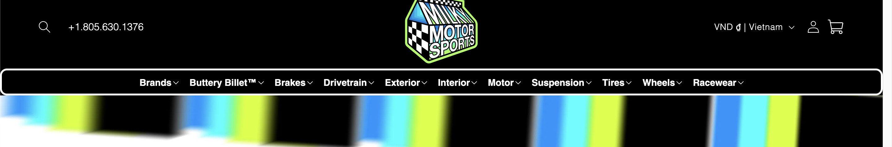
The result
Hope that helps!