Dawn Theme- Resizing to fit Mobile Screen

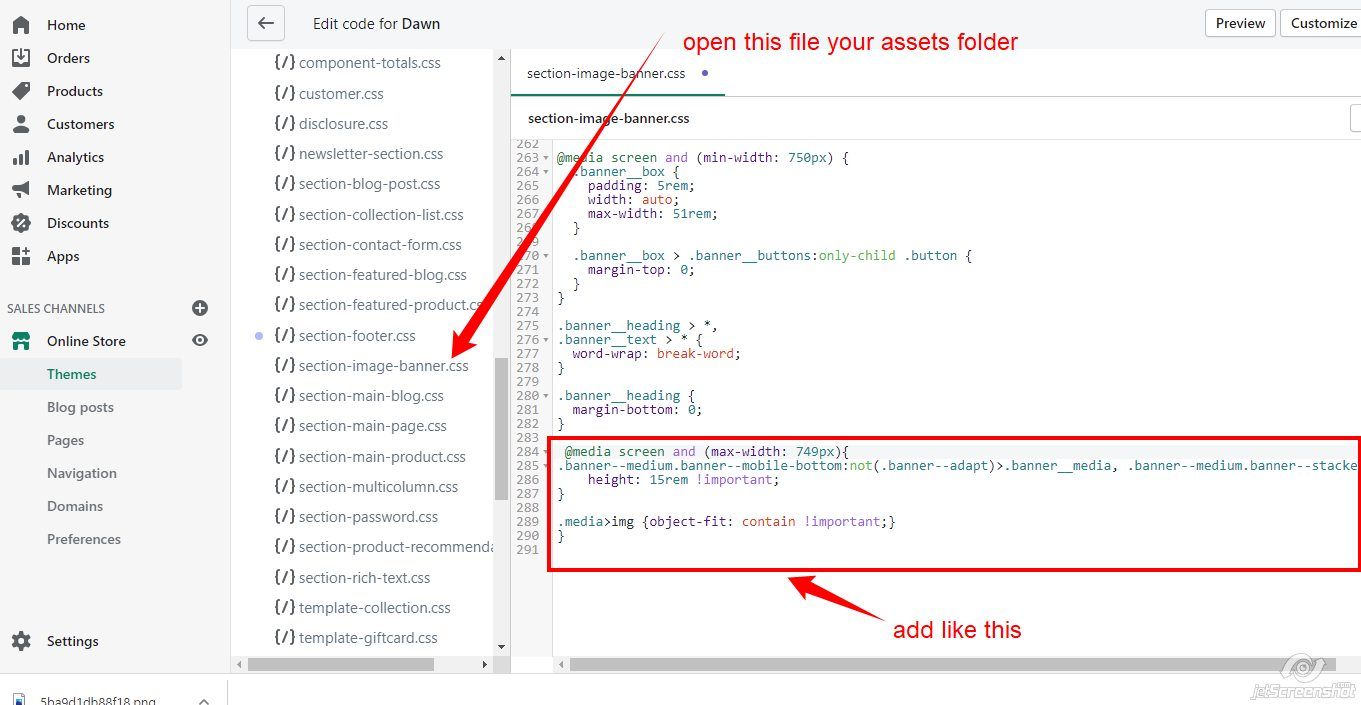
My banners look so pretty on a desktop but whenever i click over on my phone it cuts off the banners and it just looks completely different. I’m using the Dawn Theme. and I would like to find out what needs to be done so it looks right on both devices. I’ll post my link so you guys can see it.

https://theeglamlabb.myshopify.com/

PASSWORD IF IT ASKS: jada

2 Likes

@jndunlap

lease Go to Online Store->Theme->Edit code then go to assets/section-image-banner.css ->paste below code at the bottom of the file

@media screen and (max-width: 749px){
.banner--medium.banner--mobile-bottom:not(.banner--adapt)>.banner__media, .banner--medium.banner--stacked:not(.banner--mobile-bottom):not(.banner--adapt)>.banner__media {
    height: 15rem !important;
}

.media>img {object-fit: contain !important;}
}

Thanks!

1 Like

Hey! I’m very new and i’ve never coded anything before sadly? Could you explain with a little more detail what i need to do because Whenever I did it, the coding didn’t change anything and it actually just showed the code on the actual site

1 Like

@jndunlap

Please Go to Online Store->Theme->Edit code then go to assets/section-image-banner.css ->paste below code at the bottom of the file .

@media screen and (max-width: 749px){
.banner--medium.banner--mobile-bottom:not(.banner--adapt)>.banner__media, .banner--medium.banner--stacked:not(.banner--mobile-bottom):not(.banner--adapt)>.banner__media {
    height: 15rem !important;
}

.media>img {object-fit: contain !important;}
}

Please check following screenshot

okay it fixed it but it also does this, does that mean i know need to make my banners wider ?

@jndunlap

No , what do you want plase share screensht

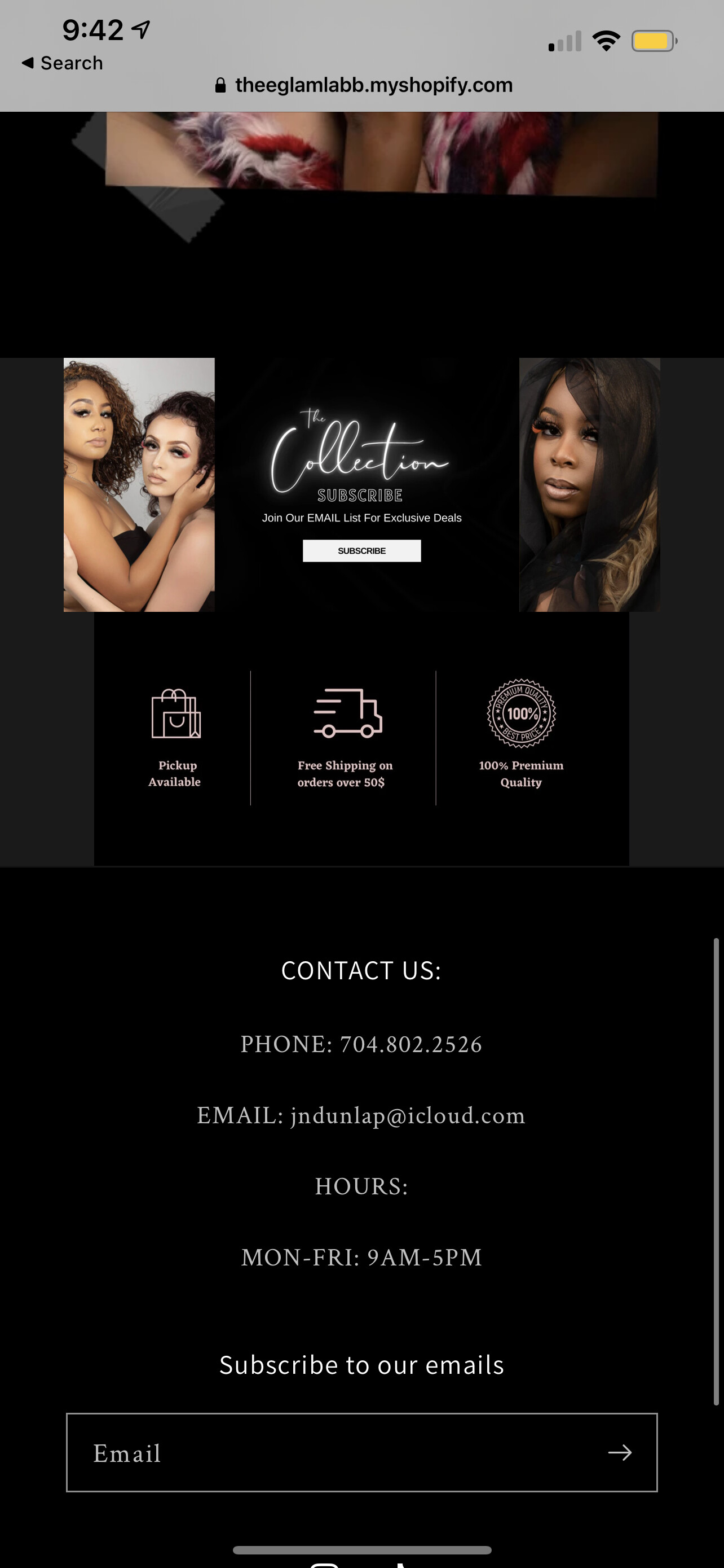
@dmwwebartisan I think the same logic applies here but is there any way to show a full-screen mobile banner? I would like automatic width and 100% height so that it fits on the screen but not sure what code I should write.