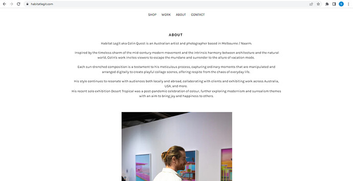
Hi All,
I have replaced my Debut theme default home page with a custom ‘About’ page.
When the home page loads on desktop I have noticed the width of my content is full screen and I would like it to appear the same width when selecting the About page.
I have attached some examples - Hopefully this makes sense!
https://www.habitatlegit.com/
Just use the class page-width in the main div your content will be show in the container.
Hello @ColinQuest ,
I understand you are looking to display the Home Page content similar to the About Page.
You can implement this change with the help of CSS code
Add the code at the bottom of the theme.liquid file before tag and save.
After applying code output will be like this -: https://prnt.sc/9HvZcVIzl-pL
I hope the code helps you.
Please share if you need any further assistance.
Thank you.
Can I please ask for a guide to do this?
Thanks Anshul,
This has fixed the home page issue but it has affected/ shrunken the content on my shop page.
Any suggestions?
Hello @ColinQuest ,
I see the Home Page code affects the Shop page as well, it is because both the pages have the same class & ID name.
You need to change or provide a different Id or class in the tags used in the Shop Page and it will be time-consuming.
You can add the below code in the theme.liquid file before tag & save, to extend the product listing images to some extent.
.page-width {
padding: 0 !important;
}
I hope it helps.
Thank you.
Thanks for your help Anshul 
Not perfect but it works well
Hello @ColinQuest ,
Thank you for accepting my solution, please also liked by solution.
It will be highly appreciated.
Thank you.
Hello,
Could you please help me with this codes?
I would like the Text columns with images section to display the 5 images in a single row side by side for the desktop version.
For the mobile version, I would like them to appear one image at a time in a slideshow, with navigation arrows or automatic transitions if possible.
https://mfvxxq-kt.myshopify.com/
0876624960
and
For the header in the desktop version:
- I want the logo to be centered.
- The menu should be on the left, and the cart should be on the right, without the search bar.
- They should all be aligned with the logo.
- The menu font should be Lora, bold, and at least 30% larger.
For the mobile version:
- The menu should be on the left, the logo in the center, and the cart on the right.
Thank you in advance for your assistance!


