Hi guys, i am having a problem with my website. It should be easy but i cant make it work and it would be amazing if someone could help me out. It looks fine on the desktop but on the mobile the logo and menu are on the left and it does not look good. It should be like the demo logo to the left and menu to the right. Can you help me move the mobile menu to the right and keep the logo on the left?
@Jonas8 ,
Please share your website URL.
Thank you, andchairs.com
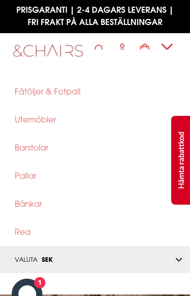
The mobile menu and logo are both on the left for some reason.

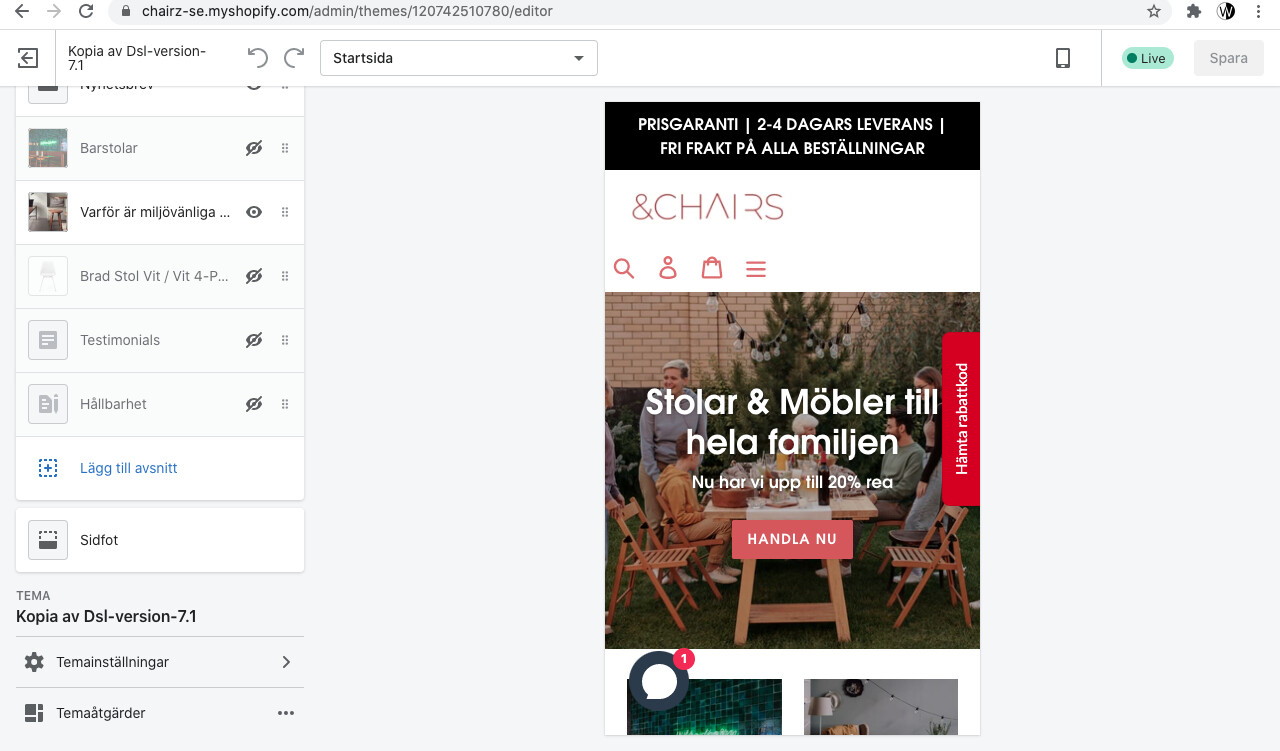
On my phone and i have tried others it looks like this my friend
When im logged in customization and look on phone view it looks like this as well.
@Jonas8 , on my browser and phone, it looks the same as the screenshot @Muhammad_Ali_S posted. Try clearing your cache and cookies and logging in again to your shopify store. You might want to try it in incognite mode as well.

Thank you for having look but it still looks like that for me on my phone and in Shopify customization which is strange. I have cleared the cache and cookies.
Looks like your navigation menu is hidden on small screen, so the menu on the right moves to left. You can add this to your CSS file at the very end (go to Themes → Edit code → Assets → themes.scss.css :
@media only screen and (max-width: 749px) {
.site-header .grid--table:nth-child(2){
display: block;
margin-left: auto;
}
}


@media only screen and (max-width: 749px) {
.site-header .grid--table:nth-child(2){
display: inline-block;
margin-left: auto;
vertical-align: top;
margin-top: 10px;
}

.site-header .site-header__icons {
    display: inline-block;
}
}
You can change .site-header__icons in the CSS code to display:inline-block;
Basically you can simplify your code like this:
/* Navigation Menu */
@media only screen and (max-width: 749px) {
  .site-header .grid {
    display: inline-block;
    width: 45.5%;
    vertical-align: top; }
  .site-header .site-header__icons {
    display: inline-block; }
  .site-header .site-header__icon {
    position: relative;
    top: -2px; }

 .site-header .grid--table:nth-child(2) {
    margin-left: auto;
    margin-top: 10px;}

  .mobile-nav-wrapper.js-menu--is-open {
    transform: translateY(100px) !important; }
 }
Thank you very much its on the right, you are awesome! Its just on thing the menu is overlapping the icons and close button?
Fixed the overlap.
/* Navigation Menu */
@media only screen and (max-width: 749px) {
  .site-header .grid {
    display: inline-block;
    width: 45.5%;
    vertical-align: top; }
  .site-header .site-header__icons {
    display: inline-block; }
  .site-header .site-header__icon {
    position: relative;
    top: -2px; }

 .site-header .grid--table:nth-child(2) {
    margin-left: auto;
    margin-top: 10px;
    position:relative;
    z-index:9;
}

  .mobile-nav-wrapper.js-menu--is-open {
    transform: translateY(100px) !important; }
 }
Now it looks perfect, thanks again you are a super girl!
Wish you all the best:)
Jonas
1 Like