Decrease Mobile Text & Item Sizing on Homepage

Topic summary

Goal: Reduce mobile font sizes and UI elements on the homepage to roughly half, as indicated in screenshots (URL provided). Screenshots primarily serve to identify the targeted elements.

Initial fix: A CSS media query (max-width: 768px) to be added in style.css adjusts:

  • Paragraph text in overlay (overlay-text__rte.rte p) to 10px.
  • Overlay title (h2.overlay-text__title.h1-style) to 27px.

Follow-up request: Also shrink mobile button text and the carousel pagination dots (“slick dots”) by half.

Update provided: Additional CSS under the same mobile media query sets:

  • Carousel dot SVG size (slick-dots li button.custom-dot svg) to 8px by 8px.
  • Overlay button text (.overlay-text__button.button.altcolour) to 7px.

Notes:

  • “Media query” targets mobile screens (≤768px width).
  • “Slick dots” are the carousel’s pagination indicators.

Status: No explicit confirmation from the requester yet; changes appear to address the asked reductions, pending validation.

Summarized with AI on December 15. AI used: gpt-5.

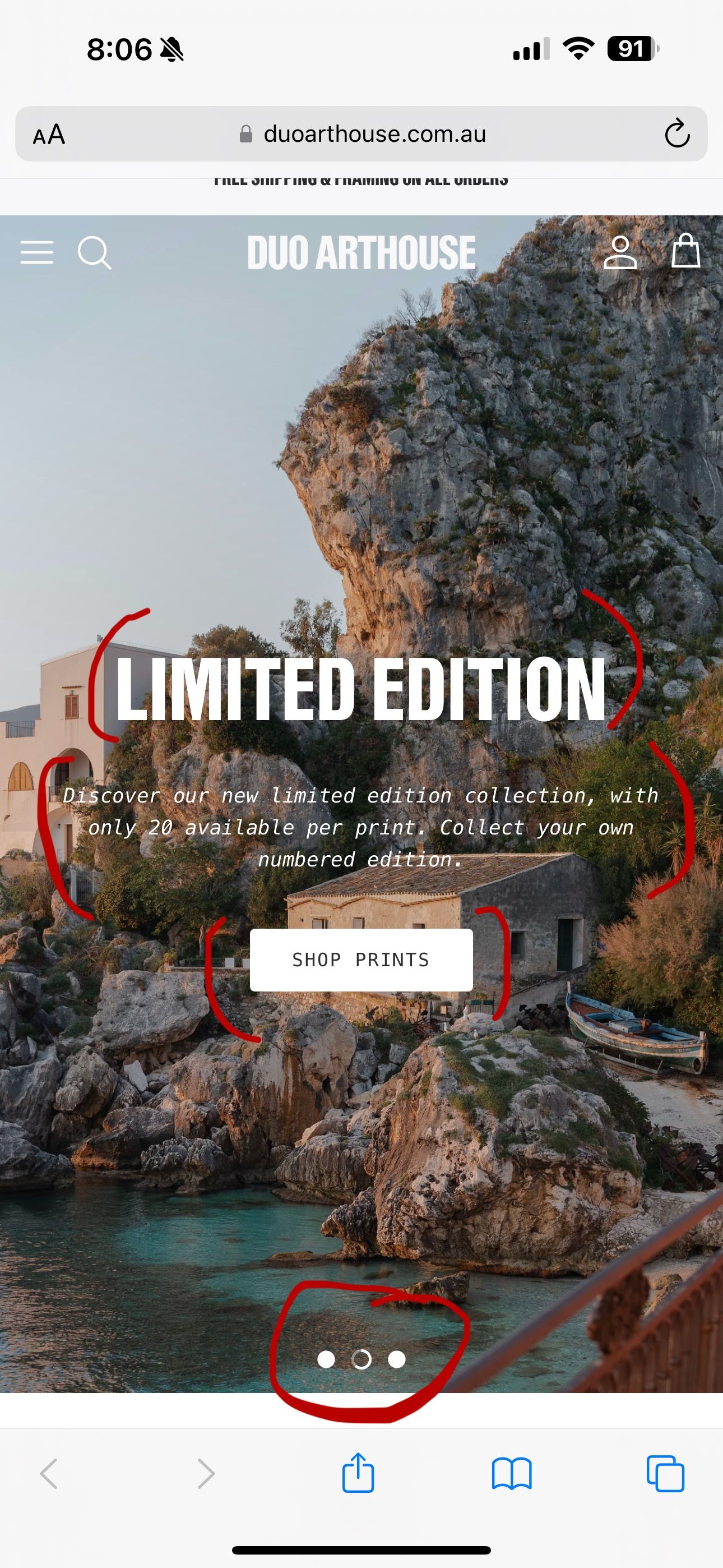
I am looking to decrease the text and size of all the red circled items in the below screenshot - ideally all by half.

URL: duoarthouse.com.au

@duart2023
Paste in style.css

@media only screen and (max-width: 768px) {
.overlay-text__rte.rte p {
    font-size: 10px !important;
}
h2.overlay-text__title.h1-style {
    font-size: 27px !important;
}
}
1 Like

@mrashid_1 Thank you! Although is it possible to also change the mobile button size and dot sizes - as pictured? Again by half the size.

@duart2023

@media only screen and (max-width: 768px) {
.slick-dots li button.custom-dot svg {
    height: 8px !important;
    width: 8px !important;
}
a.overlay-text__button.button.altcolour {
    font-size: 7px !important;
}
}