Hashan
May 14, 2021, 11:42pm
1
Dear All,
Greetings!
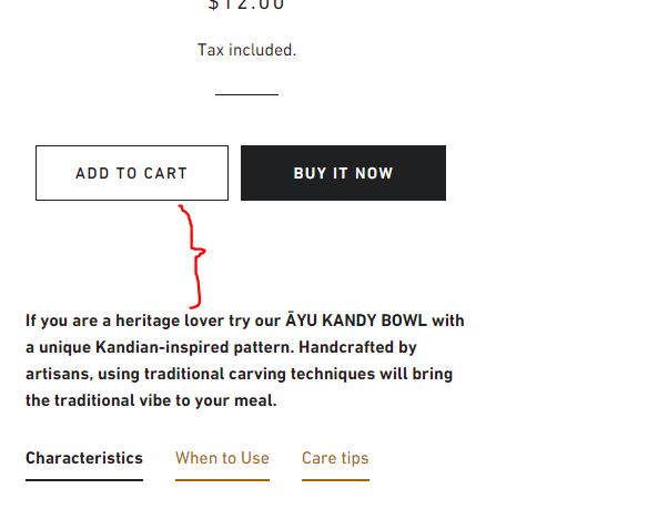
I am having an issue with the wider space from Add to cart to Description, any suggestions to reduce this gap, without compromising quality in both Mobile & PC. Below is a screenshot Thank you very much. (The highlighted red area is the gap I need to reduce).
@Hashan ,
Please share you store URL so we can help.
@Hashan
Please share your website URL and password if any. I will check and provide a solution here.
Thanks!
hello @Hashan
Please provide website url and if your store is password protected then also provide password So I will check and provide a solution here.
Hashan
May 16, 2021, 11:04am
6
Dear All,
Please find the required information below,
www.ayuecoshop.com
pw - edaixi
@Hashan
Please add the following code at the bottom of your assets/timber.scss.liquid file.
.template-product .product-single__description{
margin-top: 0px !important;
}
Hope this helps.
Thanks!
Hashan
May 16, 2021, 11:35am
8
Hi,
Thanks for the swift response, will revert soon after applying.
thank you very much.
Reards.
Hashan
May 16, 2021, 11:50am
9
@dmwwebartisan Job well done. Thank you so much for your support and swift response.
@Kinjaldavra and @Muhammad_Ali_S Really appreciate for both of you for coming forward to support on this matter
@Hashan
It’s my pleasure to help you.
mahis
September 23, 2021, 12:50pm
11
I’m facing the same issue in minimal theme..pl help
website: https://geniekart.in/products/flexible-toilet-brush
@mahis
Please share screenshot what do you want!
mahis
September 23, 2021, 3:45pm
13
Hi..Need to reduce space between buy it now & the discount badge
hello @mahis
please Go to Online Store->Theme->Edit code then go to assets/theme.css ->paste below code at the bottom of the file.
.template-product .shopify-payment-button__button--hidden {
display: none;
}
mahis
September 24, 2021, 6:43am
15
It solved my issue..Thank you so much..