How do I get the mobile view’s menu item to appear the same as my desktop’s? Ie: “sale” to appear bold and red

This is the code I used under base.css:
#HeaderMenu-shop{font-weight:bold}
#HeaderDrawer-shop{font-weight:bold}
#HeaderMenu-sale{font-weight:bold}
#HeaderDrawer-sale{font-weight:bold}
#HeaderMenu-sale{color:#DC143C;}
and this under theme.liquid:
I’m using Sense theme.
Appreciate the advice.
2 Likes
rajweb
2
Hey @uc_pharm ,
To make the “SALE” menu item in your mobile menu (drawer) appear red and bold (just like the desktop version), you’ll need to:
Fix the CSS code in theme.liquid:
What you had:
font-weight: bold
red
This is incorrect because red is not a valid CSS property by itself.
Replace with:
The #HeaderMenu-sale targets desktop; #HeaderDrawer-sale targets mobile.
Let me know if you want to make the hover state red too, or if you’re using dynamic menu items that need class-based targeting instead of IDs.
If you want any other tweak with you store please feel free to reach out thanks
Best Regards
Rajat
Shopify Expert
https://rajatweb.dev/
1 Like
Moeed
3
Hey @uc_pharm
Follow these Steps:
-
Go to Online Store
-
Edit Code
-
Find theme.liquid file
-
Add the following code in the bottom of the file above tag
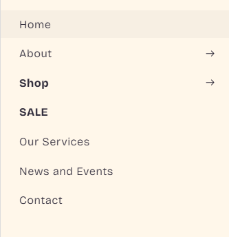
RESULT:
If I managed to solve your problem then, don’t forget to Like it and Mark it as Solution!
Best Regards,
Moeed
1 Like
Hello @uc_pharm
Go to online store ----> themes ----> actions ----> edit code ----> base.css
add this code at the end of the file and save.
@media only screen and (max-width: 767px) {
#HeaderDrawer-shop {
  color: red !important;
}
}
result
If this was helpful, hit the like button and accept the solution.
Thanks
1 Like
Hi @uc_pharm , kindly provide your store URL please and if it is password protected, please share the password as well. Thanks