Hi @nils_rbg
Please follow these steps:
-
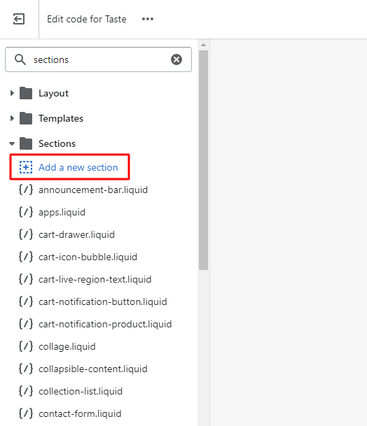
Step 1: At Shopify Admin, select Online Store → Themes → Edit Code
-
Step 2: Find the Sections folder, select Add a new section
- Step 3: Create a new liquid file named image-banner-mobile.liquid → click DONE
- Step 4: At the image-banner-mobile.liquid file, delete all the old code, copy and paste this code:
{{ 'section-image-banner.css' | asset_url | stylesheet_tag }}

{%- if section.settings.image_height == 'adapt' and section.settings.image != blank -%}
  {%- style -%}
    @media screen and (max-width: 749px) {
      #Banner-{{ section.id }}::before,
      #Banner-{{ section.id }} .banner__media::before,
      #Banner-{{ section.id }}:not(.banner--mobile-bottom) .banner__content::before {
        padding-bottom: {{ 1 | divided_by: section.settings.image.aspect_ratio | times: 100 }}%;
        content: '';
        display: block;
      }
    }

    @media screen and (min-width: 750px) {
      #Banner-{{ section.id }}::before,
      #Banner-{{ section.id }} .banner__media::before {
        padding-bottom: {{ 1 | divided_by: section.settings.image.aspect_ratio | times: 100 }}%;
        content: '';
        display: block;
      }
    }
  {%- endstyle -%}
{%- endif -%}

{%- style -%}
  #Banner-{{ section.id }}::after {
    opacity: {{ section.settings.image_overlay_opacity | divided_by: 100.0 }};
  }
{%- endstyle -%}

  {%- if section.settings.image != blank -%}


      {%- liquid
        assign image_height = section.settings.image.width | divided_by: section.settings.image.aspect_ratio
        if section.settings.image_2 != blank
          assign image_class = 'banner__media-image-half'
        endif
        if section.settings.image_2 != blank and section.settings.stack_images_on_mobile
          assign sizes = '(min-width: 750px) 50vw, 100vw'
        elsif section.settings.image_2 != blank
          assign sizes = '50vw'
        else
          assign sizes = '100vw'
        endif
      -%}
      {{
        section.settings.image
        | image_url: width: 3840
        | image_tag:
          loading: 'lazy',
          width: section.settings.image.width,
          height: image_height,
          class: image_class,
          sizes: sizes,
          widths: '375, 550, 750, 1100, 1500, 1780, 2000, 3000, 3840'
      }}


  {%- elsif section.settings.image_2 == blank -%}

      {{ 'lifestyle-2' | placeholder_svg_tag: 'placeholder-svg' }}


  {%- endif -%}
  {%- if section.settings.image_2 != blank -%}

      {%- liquid
        assign image_height_2 = section.settings.image_2.width | divided_by: section.settings.image_2.aspect_ratio
        if section.settings.image != blank
          assign image_class_2 = 'banner__media-image-half'
        endif
        if section.settings.image != blank and section.settings.stack_images_on_mobile
          assign sizes = '(min-width: 750px) 50vw, 100vw'
        elsif section.settings.image != blank
          assign sizes = '50vw'
        else
          assign sizes = '100vw'
        endif
      -%}
      {{
        section.settings.image_2
        | image_url: width: 3840
        | image_tag:
          loading: 'lazy',
          width: section.settings.image_2.width,
          height: image_height_2,
          class: image_class_2,
          sizes: sizes,
          widths: '375, 550, 750, 1100, 1500, 1780, 2000, 3000, 3840'
      }}


  {%- endif -%}


      {%- for block in section.blocks -%}
        {%- case block.type -%}
          {%- when 'heading' -%}
            ##
              {{ block.settings.heading | escape }}

          {%- when 'text' -%}

              {{ block.settings.text | escape }}


          {%- when 'buttons' -%}

              {%- if block.settings.button_label_1 != blank -%}

                  {{- block.settings.button_label_1 | escape -}}

              {%- endif -%}
              {%- if block.settings.button_label_2 != blank -%}

                  {{- block.settings.button_label_2 | escape -}}

              {%- endif -%}


        {%- endcase -%}
      {%- endfor -%}


{% schema %}
{
  "name": "Image Mobile Banner",
  "tag": "section",
  "class": "section",
  "disabled_on": {
    "groups": ["header", "footer"]
  },
  "settings": [
    {
      "type": "image_picker",
      "id": "image",
      "label": "t:sections.image-banner.settings.image.label"
    },
    {
      "type": "image_picker",
      "id": "image_2",
      "label": "t:sections.image-banner.settings.image_2.label"
    },
    {
      "type": "range",
      "id": "image_overlay_opacity",
      "min": 0,
      "max": 100,
      "step": 10,
      "unit": "%",
      "label": "t:sections.image-banner.settings.image_overlay_opacity.label",
      "default": 0
    },
    {
      "type": "select",
      "id": "image_height",
      "options": [
        {
          "value": "adapt",
          "label": "t:sections.image-banner.settings.image_height.options__1.label"
        },
        {
          "value": "small",
          "label": "t:sections.image-banner.settings.image_height.options__2.label"
        },
        {
          "value": "medium",
          "label": "t:sections.image-banner.settings.image_height.options__3.label"
        },
        {
          "value": "large",
          "label": "t:sections.image-banner.settings.image_height.options__4.label"
        }
      ],
      "default": "medium",
      "label": "t:sections.image-banner.settings.image_height.label",
      "info": "t:sections.image-banner.settings.image_height.info"
    },
    {
      "type": "select",
      "id": "desktop_content_position",
      "options": [
        {
          "value": "top-left",
          "label": "t:sections.image-banner.settings.desktop_content_position.options__1.label"
        },
        {
          "value": "top-center",
          "label": "t:sections.image-banner.settings.desktop_content_position.options__2.label"
        },
        {
          "value": "top-right",
          "label": "t:sections.image-banner.settings.desktop_content_position.options__3.label"
        },
        {
          "value": "middle-left",
          "label": "t:sections.image-banner.settings.desktop_content_position.options__4.label"
        },
        {
          "value": "middle-center",
          "label": "t:sections.image-banner.settings.desktop_content_position.options__5.label"
        },
        {
          "value": "middle-right",
          "label": "t:sections.image-banner.settings.desktop_content_position.options__6.label"
        },
        {
          "value": "bottom-left",
          "label": "t:sections.image-banner.settings.desktop_content_position.options__7.label"
        },
        {
          "value": "bottom-center",
          "label": "t:sections.image-banner.settings.desktop_content_position.options__8.label"
        },
        {
          "value": "bottom-right",
          "label": "t:sections.image-banner.settings.desktop_content_position.options__9.label"
        }
      ],
      "default": "middle-center",
      "label": "t:sections.image-banner.settings.desktop_content_position.label"
    },
    {
      "type": "checkbox",
      "id": "show_text_box",
      "default": true,
      "label": "t:sections.image-banner.settings.show_text_box.label"
    },
    {
      "type": "select",
      "id": "desktop_content_alignment",
      "options": [
        {
          "value": "left",
          "label": "t:sections.image-banner.settings.desktop_content_alignment.options__1.label"
        },
        {
          "value": "center",
          "label": "t:sections.image-banner.settings.desktop_content_alignment.options__2.label"
        },
        {
          "value": "right",
          "label": "t:sections.image-banner.settings.desktop_content_alignment.options__3.label"
        }
      ],
      "default": "center",
      "label": "t:sections.image-banner.settings.desktop_content_alignment.label"
    },
    {
      "type": "select",
      "id": "color_scheme",
      "options": [
        {
          "value": "accent-1",
          "label": "t:sections.all.colors.accent_1.label"
        },
        {
          "value": "accent-2",
          "label": "t:sections.all.colors.accent_2.label"
        },
        {
          "value": "background-1",
          "label": "t:sections.all.colors.background_1.label"
        },
        {
          "value": "background-2",
          "label": "t:sections.all.colors.background_2.label"
        },
        {
          "value": "inverse",
          "label": "t:sections.all.colors.inverse.label"
        }
      ],
      "default": "background-1",
      "label": "t:sections.all.colors.label",
      "info": "t:sections.image-banner.settings.color_scheme.info"
    },
    {
      "type": "header",
      "content": "t:sections.image-banner.settings.header.content"
    },
    {
      "type": "select",
      "id": "mobile_content_alignment",
      "options": [
        {
          "value": "left",
          "label": "t:sections.image-banner.settings.mobile_content_alignment.options__1.label"
        },
        {
          "value": "center",
          "label": "t:sections.image-banner.settings.mobile_content_alignment.options__2.label"
        },
        {
          "value": "right",
          "label": "t:sections.image-banner.settings.mobile_content_alignment.options__3.label"
        }
      ],
      "default": "center",
      "label": "t:sections.image-banner.settings.mobile_content_alignment.label"
    },
    {
      "type": "checkbox",
      "id": "stack_images_on_mobile",
      "default": true,
      "label": "t:sections.image-banner.settings.stack_images_on_mobile.label"
    },
    {
      "type": "checkbox",
      "id": "show_text_below",
      "default": true,
      "label": "t:sections.image-banner.settings.show_text_below.label"
    }
  ],
  "blocks": [
    {
      "type": "heading",
      "name": "t:sections.image-banner.blocks.heading.name",
      "limit": 1,
      "settings": [
        {
          "type": "text",
          "id": "heading",
          "default": "Image mobile banner",
          "label": "t:sections.image-banner.blocks.heading.settings.heading.label"
        },
        {
          "type": "select",
          "id": "heading_size",
          "options": [
            {
              "value": "h2",
              "label": "t:sections.all.heading_size.options__1.label"
            },
            {
              "value": "h1",
              "label": "t:sections.all.heading_size.options__2.label"
            },
            {
              "value": "h0",
              "label": "t:sections.all.heading_size.options__3.label"
            }
          ],
          "default": "h1",
          "label": "t:sections.all.heading_size.label"
        }
      ]
    },
    {
      "type": "text",
      "name": "t:sections.image-banner.blocks.text.name",
      "limit": 1,
      "settings": [
        {
          "type": "text",
          "id": "text",
          "default": "Give customers details about the banner image(s) or content on the template.",
          "label": "t:sections.image-banner.blocks.text.settings.text.label"
        },
        {
          "type": "select",
          "id": "text_style",
          "options": [
            {
              "value": "body",
              "label": "t:sections.image-banner.blocks.text.settings.text_style.options__1.label"
            },
            {
              "value": "subtitle",
              "label": "t:sections.image-banner.blocks.text.settings.text_style.options__2.label"
            },
            {
              "value": "caption-with-letter-spacing",
              "label": "t:sections.image-banner.blocks.text.settings.text_style.options__3.label"
            }
          ],
          "default": "body",
          "label": "t:sections.image-banner.blocks.text.settings.text_style.label"
        }
      ]
    },
    {
      "type": "buttons",
      "name": "t:sections.image-banner.blocks.buttons.name",
      "limit": 1,
      "settings": [
        {
          "type": "text",
          "id": "button_label_1",
          "default": "Button label",
          "label": "t:sections.image-banner.blocks.buttons.settings.button_label_1.label",
          "info": "t:sections.image-banner.blocks.buttons.settings.button_label_1.info"
        },
        {
          "type": "url",
          "id": "button_link_1",
          "label": "t:sections.image-banner.blocks.buttons.settings.button_link_1.label"
        },
        {
          "type": "checkbox",
          "id": "button_style_secondary_1",
          "default": false,
          "label": "t:sections.image-banner.blocks.buttons.settings.button_style_secondary_1.label"
        },
        {
          "type": "text",
          "id": "button_label_2",
          "default": "Button label",
          "label": "t:sections.image-banner.blocks.buttons.settings.button_label_2.label",
          "info": "t:sections.image-banner.blocks.buttons.settings.button_label_2.info"
        },
        {
          "type": "url",
          "id": "button_link_2",
          "label": "t:sections.image-banner.blocks.buttons.settings.button_link_2.label"
        },
        {
          "type": "checkbox",
          "id": "button_style_secondary_2",
          "default": false,
          "label": "t:sections.image-banner.blocks.buttons.settings.button_style_secondary_2.label"
        }
      ]
    }
  ],
  "presets": [
    {
      "name": "Image Mobile Banner",
      "blocks": [
        {
          "type": "heading"
        },
        {
          "type": "text"
        },
        {
          "type": "buttons"
        }
      ]
    }
  ]
}
{% endschema %}
- Step 5: Find and open the file base.css, and add this code at the end of the file:
.banner.banner--mobile {
  display: none !important;
}
.banner:not(.banner--mobile) {
  display: none !important;
}

@media screen and (max-width: 989px) {
    .banner.banner--mobile {
      display: block !important;
    }
}

@media screen and (min-width: 990px) {
    .banner:not(.banner--mobile) {
      display: block !important;
    }
}
At Customize Theme, you can add a banner section for mobile.
We hope that it will work for you.