Hi there 
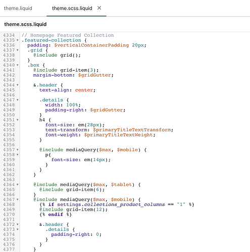
I’m using the District theme and having an issue with left hand side padding on the homepage featured collection element on mobile, just the text element is skewed slightly to the right hand side. When I inspect elements I can see that there is padding added to the left hand side (30px) but because of the code compilation when I go to edit the code I can’t figure out which bit needs editing to remove it. Any ideas where this is controlled from? TIA!
hii, @Lizzieepton
Kindly share your store URL so,
I can solve your issue and give you a proper solition.
Thank You.
hii, @Lizzieepton
Can you send me a screenshot what you want so,
I can understand your problem.
Thank You.
Hi @Zworthkey ,
Are my original screenshots not showing? On the image below the text is all skewed to the right, that screenshot is full screen for my mobile view
I can see when I inspect elements that there is some padding there which is pushing it over
hello @Lizzieepton
please Go to Online Store->Theme->Edit code then go to assets/theme.css ->paste below code at the bottom of the file.
@media only screen and (max-width: 768px) {
.shopify-section.featured-collection-section .box.header.featured-grid-title-right{
    padding: 0;
    margin: 0;
}
}
Hi @Kinjaldavra ,
That doesn’t appear to be working, I don’t know if this makes a difference but instead of a theme.css file i have a theme.scss.liquid file, which i pasted your code right at the bottom of, do you think i posted it in the wrong place?
hell @Lizzieepton
added below code in to theme.scss.liquid bottom of file.
@media only screen and (max-width: 768px) {
.shopify-section.featured-collection-section .box.header{
    padding: 0;
    margin: 0;
}
}
1 Like
Thank you @Kinjaldavra that worked 
![]()


