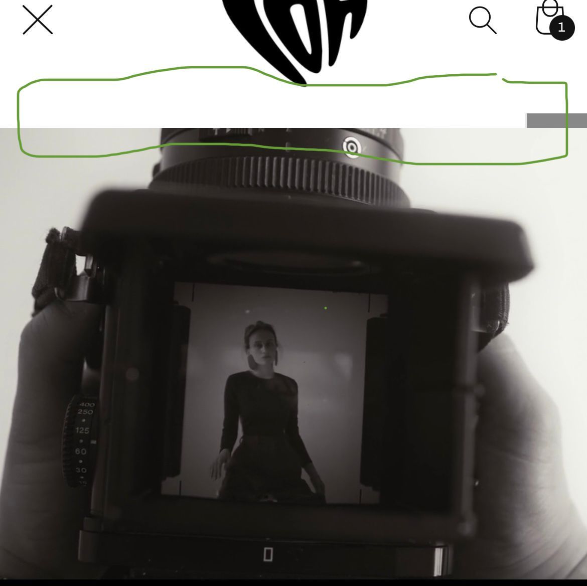
I noticed that Menu Drawer in the header is not responsive or it may be going to the back of the video banner which is under the template


To make the menu drawer in the header responsive in your Shopify store, you may need to modify the CSS code. Here’s what you can do:
- Open the theme editor in your Shopify admin and go to “Edit code”.
- In the “Assets” folder, find the “theme.scss.liquid” file and open it.
- Scroll down to the bottom of the file and add the following CSS code:
@media only screen and (max-width: 767px) {
.site-header__drawer {
z-index: 999;
}
}
Thanks you for your response, sorry my bad but I just didn’t see, it’s responsive however its going back under the video banner.
check link : https://cdn.shopify.com/videos/c/o/v/fb87c261c38b4ab6950aa877cc71b75e.mp4
anyway regarding this Im in Dawn Theme 9
I cant seem to find this
In the “Assets” folder, find the “theme.scss.liquid”
I only have theme.liquid and theme editor.js
I figured it out myself just
just use "z-index: -1; "and places it behind other elements on the page