Hello.
This is my page url:
https://nobwh4pg69yfwfvj-68796285242.shopifypreview.com
(Dawn Theme)
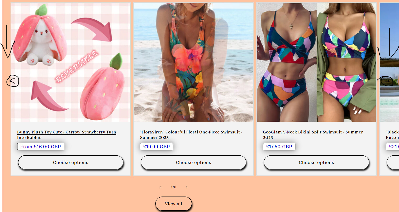
So, I would in the featured products on my home page, I want to add arrows that float on top of the products card. One on the left side, and one on the right side. These arrows should navigate the buyer between featured products.
Please look the picture below for reference:
I want to be able to customise these arrows, i.e. change their colour, size etc.
Thanks in advance.
Hi Andy106,
it requires some coding and some CSS changes.
To customize the Arrow buttons, we have to add schema settings and write some code.
if you need help in coding so please let me know on my email.
Thanks & Regards
Sandeep
Can you provide some more informatio on this, how to do it, etc? Thanks!
Hi @Andy106
We’re BSS Commerce - Shopify Partners & Experts providing Shopify apps and Store Development on Shopify & Shopify Plus.
We saw that you need to customise these arrows, i.e. change their colour, size etc. It’s what we can help with an optimal solution. If you need help from our expert, kindly share your request with us via Shopify experts.
We will check it and give you a detailed solution. We’re looking forward to working with you.
Found the solution here: https://community.shopify.com/c/shopify-design/dawn-theme-featured-collection-slider/td-p/1816327
- Go to Online Store → Theme → Edit code
- Open your theme.liquid theme file
- Paste the below code before
[details=Show More]
Show More
.collection .slider-component-desktop .slider-counter {
Show More
display: none;
Show More
}
Show More
.collection .slider-component-desktop .slider-buttons {
Show More
position: absolute;
Show More
transform: translateY(-50%);
Show More
top: 35%;
Show More
width: 100%;
Show More
justify-content: space-between;
Show More
z-index: 9;
Show More
transition: 0.5s;
Show More
opacity: 0;
Show More
padding: 0 2%;
Show More
}
Show More
.collection .slider-component-desktop:hover .slider-buttons {
Show More
opacity: 1;
Show More
}
Show More
.collection .slider-component-desktop .slider-button {
Show More
background: #000000;
Show More
color: #ffffff;
Show More
opacity: 0.7;
Show More
}
Show More
.collection .slider-component-desktop .slider-button:hover {
Show More
opacity: 1;
Show More
}
Show More
.collection .slider-component-desktop .slider-button[disabled] .icon {
Show More
color: #cdcdcd;
Show More
}
Show More
.collection .slider-component-desktop .slider-button .icon {
Show More
height: 1rem;
Show More
}
Show More
2 Likes