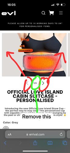
For mobile view only could you move the arrows to here (in red) then remove the bit in green?
Topic summary
A user requested a mobile-only design change to reposition navigation arrows and remove a specific element on their product page.
Solution Provided:
- Add custom CSS code to the
base.cssfile in the Shopify theme editor - The code repositions slider buttons to center (50% top/left) with full viewport width
- Hides the slider counter element
- Changes are wrapped in a media query targeting screens 749px and below (mobile only)
Outcome:
The solution was implemented successfully. The user confirmed satisfaction with the help provided, and the issue appears resolved.
Hi @Ryan1998 ,
Step 1: Go to Shopify Admin → Online Store ->Theme → Edit code
Step 2: Search file base.css
Step 3: Insert this code:
@media only screen and (max-width: 749px) {
   .slider-buttons {
     top: 50%;
     left: 50%;
     width: 100vw;
     justify-content: space-between !important;
     transform: translate(-50%, -50%);
     position: absolute;
   }

  .slider-counter {
    display: none !important;
  }
}
Here is result:
Hope this can help you,
If our suggestions are useful, please let us know by giving it a like or marking it as a solution. Thank you ![]()
1 Like
You’re always here helping, thank you!
1 Like
@Ryan1998 , I’m happy to always be able to help you ![]()
1 Like

