Hi,
I’ve managed to change my icons to text and align them vertically using ‘block,’ however, I just can’t find a way to align them like I’ve aligned my menu. I’m using the DAWN theme. Is there anyone who has the skills to help me?
Website: www.todecay.com
Thanks in advance,
Lars
1 Like
Hi @larsvilhelmsson
Seems like the block didnt help at all.
Check this one.
From your Shopify admin dashboard, click on “Online Store” and then “Themes”.
Find the theme that you want to edit and click on “Actions” and then “Edit code”.
In the “Assets” folder, click on “base.css, style.css or theme.css” file, depending on which file your theme uses to store its CSS styles. At the bottom of the file, add the following CSS code:
.header__icons {
    margin-top: -6px;
    display: flex;
    flex-direction: column;
}
And Save.
Result:
And if you like the icons close the each other. Use this code then.
.header__icons {
    display: flex;
    flex-direction: column;
}
.header__icon, .header__icon--cart .icon {
    height: fit-content;
}
And Save.
Result:
Note: If it doesnt change it mean the display; flex didnt work you need to take out the display: block.
Please don’t forget to Like and Mark Solution to the post that helped you. Thanks!
Good to hear. Would you mind to hit like also.  Thanks!
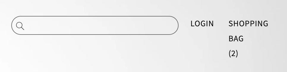
Hi sorry to jump on this thread! I have something similar, and was wondering if you could please help me put the ‘login’ and ‘shopping bag’ below the search bar and spaced at each end with the text all on one line. When I inspect the element, it looks like all 3 are part of the same grid. Thanks 
Currently how it looks:
How I want to look: