I would like to add my email address and phone number above the cart search account and menu icons in the top right. Thanks, Shopify community you are my only hope.

Here it is thanks so much!
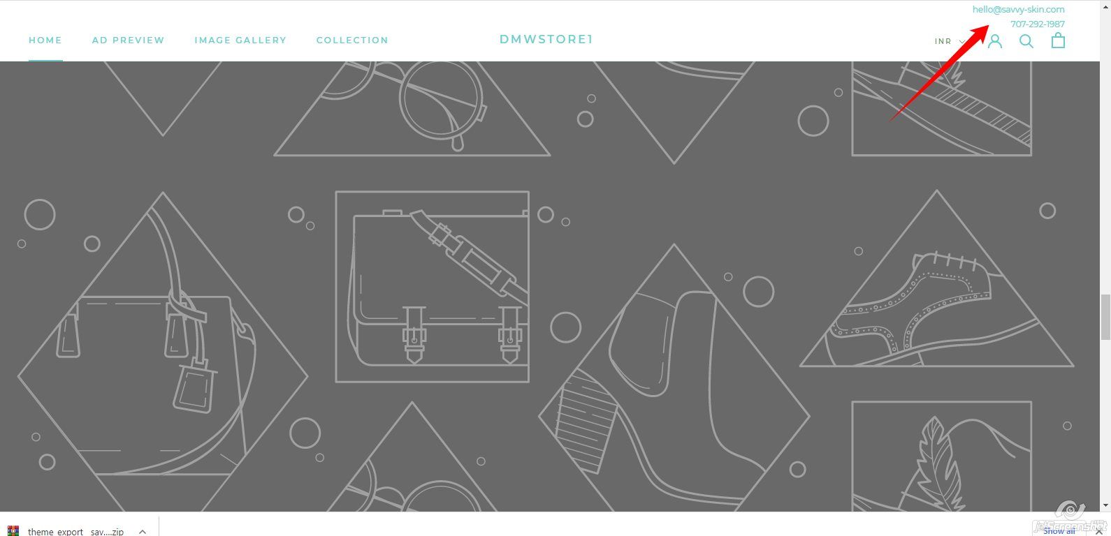
That is perfect!
1 Like
Replace following code your Sections/header.liquid file but before backup your old code
{%- comment -%}
In Prestige, the header is quite complex due to the very high number of possible combinations. If you have to edit it, please
make sure to duplicate the theme first so you can revert your changes in case any issue is introduced.
{%- endcomment -%}

{%- comment -%}
--------------------------------------------------------------------------------------------------------------------
USEFUL VARIABLES
--------------------------------------------------------------------------------------------------------------------
{%- endcomment -%}

{%- assign use_transparent_header = false -%}

{%- if template == 'index' and section.settings.enable_transparent_header -%}
  {%- assign use_transparent_header = true -%}
{%- endif -%}

{%- if template.name == 'collection' and section.settings.enable_transparent_header_collection and collection.image and collection.all_products_count > 0 and collection.template_suffix != 'no-image' -%}
  {%- assign use_transparent_header = true -%}
{%- endif -%}

{%- if section.settings.navigation_style != 'sidebar' -%}
  {%- assign use_sidebar_menu = false -%}
{%- else -%}
  {%- assign use_sidebar_menu = true -%}
{%- endif -%}

{%- comment -%}
--------------------------------------------------------------------------------------------------------------------
CURRENCY CONVERTER

The theme currency converter is used in lot of different places so to simply the code it's outputted here once
--------------------------------------------------------------------------------------------------------------------
{%- endcomment -%}

{%- if settings.currency_conversion_enabled or shop.enabled_currencies.size > 1 -%}
  {%- capture currency_conversion_select -%}


        {%- include 'icon' with 'select-arrow' -%}


  {%- endcapture -%}
{%- endif -%}

{%- comment -%}
--------------------------------------------------------------------------------------------------------------------
SEARCH FORM (implemented as a modal)

Implementation note: make sure that the Search div is always just before the Header element, as the CSS uses
                     this assumption
--------------------------------------------------------------------------------------------------------------------
{%- endcomment -%}


      {%- if settings.search_mode != 'product' -%}


      {%- endif -%}


{%- comment -%}
--------------------------------------------------------------------------------------------------------------------
HEADER CONTENT
--------------------------------------------------------------------------------------------------------------------
{%- endcomment -%}

{%- capture section_settings -%}
{
  "navigationStyle": {{ section.settings.navigation_style | json }},
  "hasTransparentHeader": {% if use_transparent_header %}true{% else %}false{% endif %},
  "isSticky": {% if section.settings.use_sticky_header %}true{% else %}false{% endif %}
}
{%- endcapture -%}

{% schema %}
{
  "name": "Header",
  "class": "shopify-section--header",
  "settings": [
    {
      "type": "checkbox",
      "id": "use_sticky_header",
      "label": "Use sticky header",
      "default": true
    },
    {
      "type": "header",
      "content": "Logo"
    },
    {
      "type": "image_picker",
      "id": "logo",
      "label": "Image",
      "info": "200 x 60px .png recommended"
    },
    {
      "type": "range",
      "id": "logo_max_width",
      "min": 50,
      "max": 350,
      "step": 5,
      "unit": "px",
      "label": "Image width",
      "default": 140
    },
    {
      "type": "range",
      "id": "mobile_logo_max_width",
      "min": 50,
      "max": 200,
      "step": 5,
      "unit": "px",
      "label": "Mobile image width",
      "default": 90
    },
    {
      "type": "header",
      "content": "Navigation"
    },
    {
      "type": "link_list",
      "id": "navigation_menu",
      "label": "Menu",
      "default": "main-menu"
    },
    {
      "type": "select",
      "id": "navigation_style",
      "label": "Navigation style",
      "info": "Setting will default to center style if screen width cannot fit all the links.",
      "options": [
        {
          "value": "sidebar",
          "label": "Sidebar"
        },
        {
          "value": "inline",
          "label": "Inline"
        },
        {
          "value": "center",
          "label": "Center"
        },
        {
          "value": "logoLeft",
          "label": "Logo left"
        }
      ],
      "default": "inline"
    },
    {
      "type": "checkbox",
      "id": "show_icons",
      "label": "Show icons",
      "info": "Text for account, search and cart are replaced by icons on desktop.",
      "default": false
    },
    {
      "type": "header",
      "content": "Transparent header"
    },
    {
      "type": "checkbox",
      "id": "enable_transparent_header",
      "label": "Enable on homepage",
      "default": false
    },
    {
      "type": "checkbox",
      "id": "enable_transparent_header_collection",
      "label": "Enable on collection pages",
      "default": false
    },
    {
      "type": "checkbox",
      "id": "show_transparent_header_border",
      "label": "Show separation border",
      "default": true
    },
    {
      "type": "color",
      "id": "transparent_text_color",
      "label": "Text/icon color",
      "default": "#ffffff"
    },
    {
      "type": "image_picker",
      "id": "transparent_logo",
      "label": "Logo image",
      "info": "200 x 60px .png recommended"
    }
  ],
  "blocks": [
    {
      "type": "mega_menu",
      "name": "Mega menu",
      "settings": [
        {
          "type": "text",
          "id": "navigation_mega_menu",
          "label": "Menu item",
          "info": "Enter menu item to apply a mega menu dropdown. [Learn more](http://support.maestrooo.com/article/149-navigation-enabling-and-configuring-mega-menu)."
        },
        {
          "type": "header",
          "content": "Image push 1"
        },
        {
          "type": "image_picker",
          "id": "push_1_image",
          "label": "Image",
          "info": "740 x 460 px .jpg recommended"
        },
        {
          "type": "text",
          "id": "push_1_heading",
          "label": "Heading",
          "default": "Example heading"
        },
        {
          "type": "text",
          "id": "push_1_subheading",
          "label": "Sub-heading",
          "default": "Example sub-heading"
        },
        {
          "type": "url",
          "id": "push_1_url",
          "label": "Link"
        },
        {
          "type": "header",
          "content": "Image push 2"
        },
        {
          "type": "image_picker",
          "id": "push_2_image",
          "label": "Image",
          "info": "740 x 460 px .jpg recommended"
        },
        {
          "type": "text",
          "id": "push_2_heading",
          "label": "Heading",
          "default": "Example heading"
        },
        {
          "type": "text",
          "id": "push_2_subheading",
          "label": "Sub-heading",
          "default": "Example sub-heading"
        },
        {
          "type": "url",
          "id": "push_2_url",
          "label": "Link"
        }
      ]
    }
  ]
}
{% endschema %}
1 Like
please Go to Online Store->Theme->Edit code then go to assets/theme.scss.liquid ->paste below code at the bottom of the file.
.custom_wrapper{
    width: 100%;
    text-align: right;
    padding: 0px 50px;
}

.mail-text {font-size: 12px; font-weight: normal;font-family: Montserrat,sans-serif; line-height:1.65;}

@media screen and (min-width: 1240px){
.Header:not(.Header--sidebar) .Header__Wrapper {
    padding: 18px 50px;
    padding-top: 0px !important;
}
}
1 Like
Can we make it show on moble too?
where to show on mobile please share screenshot.