Hi there,
I have a couple of bottom menus that in the desktop version are side by side nicely.
On the mobile version, probably because they don’t fit, it put’s them side by side.
Is there a way to squeeze both in the same row on the mobile version?
Thanks in advance for any help!
Hi @miltokas ,
Can you please provide me with the link to your site so that i can review and provide updates accordingly.
Thannk you
Hi @miltokas ,
Please add below codes at the end of base.css file.
@media only screen and (max-width: 749px) {
  footer .footer__blocks-wrapper.grid.grid--1-col.grid--2-col.grid--4-col-tablet {
        display: grid!important;
        grid-template-columns: 1fr 1fr!important;
           gap: calc(3rem / var(--font-body-scale))!important;
        width: 100%!important;
    }

    footer .footer-block.grid__item.footer-block--menu {
        margin-top: 0px!important;
    }

    footer .footer__content-top.page-width {
        padding-left: calc(3rem / var(--font-body-scale));
        padding-right: calc(3rem / var(--font-body-scale));
    }
}
Verification:
If you require further help to optimize your store, please don’t hesitate to reach out. If you find this information useful, a Like would be greatly appreciated. And if this solves the problem, please Mark it as Solution!
Best Regards,
Mangit
Hi @miltokas
The the provided code doesnot work and if this is a urgent task, you can message me on whats app. I will go AFK for now.
Hi @theycallmemakka
Do you know what I have to change in the provided code to make it work?
Thanks a lot for your support!
Hi @miltokas ,
You can add the below code codes at the end of theme.liquid
Code:
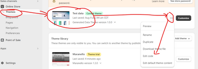
Steps to add CSS:
Step 1: Go to Online Store > Themes > Active theme > Edit
Step 2: Search for “theme.liquid”

Step 3: Add the CSS above “”

If you require further help to optimize your store, please don’t hesitate to reach out. If you find this information useful, a Like would be greatly appreciated. And if this solves the problem, please Mark it as Solution!
Best Regards,
Mangit
Hi @theycallmemakka
First of all thanks a lot for your support!
I think we are getting closer, what I meant is that the two columns (1) should be side by side and the subscribe to our emails underneath taking the full length.
Hi @miltokas ,
Can you add the updated CSS.