Hey All,
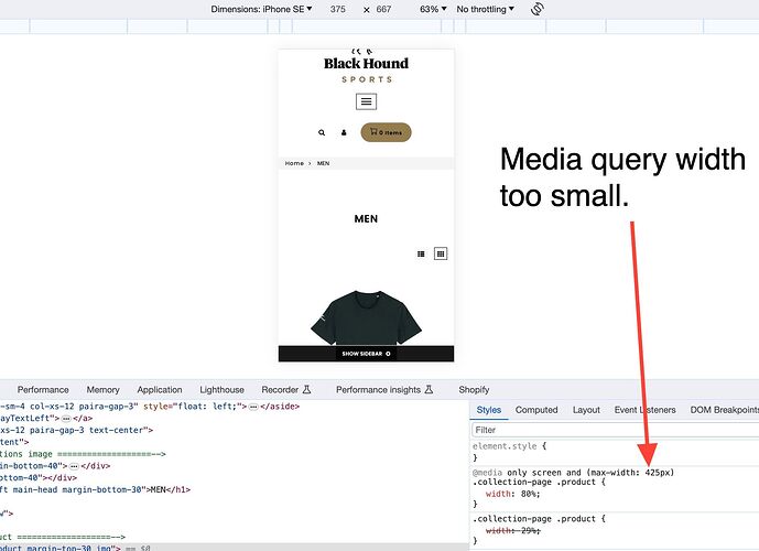
How can I fix this view to only have one product per row on mobile?
Working for Android but on some apple devices it has mutliple products on each row that messes up the alignment.
Is there an easy fix to make the first image below:
Look more like this:
Page is: www.blackhoundsports.com
Please do let me know if you have any ideas.
Cheers!
Hi @drewhound , it looks there is a style rule in the gang-custom-css-shopify–main.css file that sets it to one product per row, but only for screens less than 425px wide. I think changing the “425” to a value of “767” or “1024” will also cause larger mobile devices to have one product per row.
if the file is minified and hard to edit, you can paste this rule at the bottom of the file to override the current styles.
@media only screen and (max-width: 1024px){
  .collection-page .product {
      width: 80%;
  }
}
Awesome, this worked, knew I was missing something, thank you!


