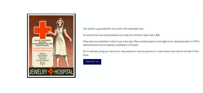
Hi there! I am trying to build out a new website for our jewelry store and have encountered the same problem on several different pages throughout.
I would like to display text next to an image in a custom content section using the Broadcast theme. I want the section to be the same height as the image, with the text centered in the whitespace next to it. Instead the image is getting cut off, as the section height is determined by the amount of text entered.
You can an example of this issue here: https://lorimclean.com/pages/repairs
And suggestions on how to resolve this would be greatly appreciated!!
1 Like
Hello @LMc_Jewelry
I would like to give you some recommendations to support you
- Go to Online Store → Theme → Edit code
- Open your theme.liquid theme file
- Paste the below code before
If you require any further information, feel free to contact me.
Best regards,
GemPages Support Team
Hi @LMc_Jewelry
In your case, you can try the following steps:
- Go to Online Store → Theme → Edit code → theme.css and paste this code at the end of the file:
.background-size-cover {
  background-size: contain;
  background-repeat: no-repeat;
}
.section-padding > .brick__section {
  min-height: 650px !important;
}
And you can change “650px” to set the min-height of the container containing the image and text as desired. I recommend it should be between 600px and 1000px.
I hope you find my answer helpful!
Regards,
BSS Commerce
Hi @LMc_Jewelry ,
Go to Assets > theme.css and paste this at the bottom of the file:
.image__hero__frame .background-size-cover {
  background-size: contain !important;
    background-repeat: no-repeat !important;
    background-position: right center !important;
}
it will display like this:
Hello @KetanKumar . Thanks for your reply. I’m hoping for it to look like this. This image should still occupy the left half of the page, but it should display the image fully. To accommodate this, there should be more whitespace above and below the text on the right side of the page.
Any suggestions?
Hello @LitExtension .
Thanks for your reply. I’m hoping for it to look like this. This image should still occupy the left half of the page, but it should display the image fully. To accommodate this, there should be more whitespace above and below the text on the right side of the page.
Any suggestions?
Hi @LMc_Jewelry ,
Go to Assets > theme.css and paste this at the bottom of the file:
.image__hero__frame .background-size-cover {
  background-size: contain !important;
    background-repeat: no-repeat !important;
    background-position: right center !important;
}
.brick__section.brick--2.wrapper--full.screen-height-one-half,
.brick__block--template--16972133892375__16ac9bc2-c5ed-4118-8ece-da1616acc847-1668632981017446a4-0,
.image__hero__frame {
  min-height: 600px !important;
}
Hope it helps!
Thanks for your speedy reply @LitExtension !
This worked, but it messed up the formatting for many other sections throughout the website. Is there a way to limit the change to specific sections or specific pages?
Hi @LMc_Jewelry ,
Please change all code:
#shopify-section-template--16972133892375__16ac9bc2-c5ed-4118-8ece-da1616acc847 .image__hero__frame .background-size-cover {
  background-size: contain !important;
    background-repeat: no-repeat !important;
    background-position: right center !important;
}
#shopify-section-template--16972133892375__16ac9bc2-c5ed-4118-8ece-da1616acc847 .brick__section.brick--2.wrapper--full.screen-height-one-half,
.brick__block--template--16972133892375__16ac9bc2-c5ed-4118-8ece-da1616acc847-1668632981017446a4-0,
#shopify-section-template--16972133892375__16ac9bc2-c5ed-4118-8ece-da1616acc847 .image__hero__frame {
  min-height: 600px !important;
}


