Hi, I am really hoping someone can help me. I am happy with the way the desktop version looks, the landing pg image with text is positioned “bottom left” but on the mobile the text covers the image. I am not able to adjust the text position on mobile. This is a cry for coding help!
1 Like
Hi @GF18 , can you share your store url to check?


@GF18 , I need to enter the website itself to provide you with a solution.
password rtayta
Hi @GF18
This is Richard from PageFly - Shopify Page Builder App
Please add this code to your theme.liquid above the to get this solved
Step 1: Online Stores > Themes > More Actions > Edit code
Step 2: click on theme.liquid and paste the code above the

Hope this can help you solve the issue
Best regards,
Richard | PageFly
1 Like
This definitely worked to remove the text from the picture. Is there anyway that slogan can still show above or below the pic on mobile. If not, that is okay just thought I would ask! Thank you for your help either way!
On mobile i suggest you should keep the next section as a slogan, or you can add another sections below the image to add the correct slogan, and hide it only for desktop.
I tried to move the text block but seems like its not fit with the current layout, it will be overlap other sections and not get responsive
1 Like
Okay thank you so much for trying and the alternative option. And again, thank you so much for your help with my mobile issue. I am so appreciative!
1 Like
glad that my solution is helping, have a nice day
1 Like
Hi again @GF18
I checked out your online store and really liked the design. From my CRO expertise, I’d love to give you my suggestions as hereby:
1. Highlight Call to action button
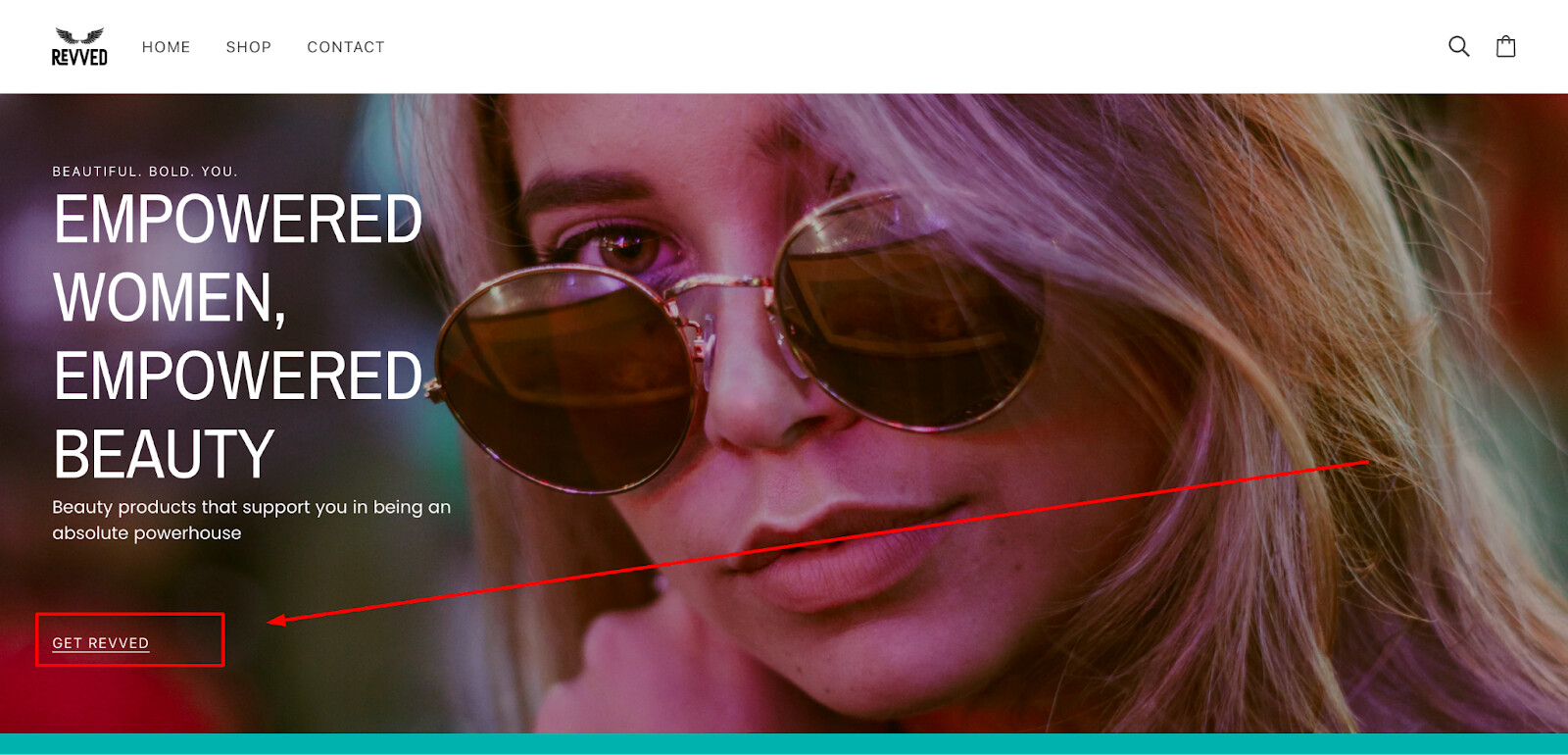
A ‘call to action’ button is really important on the homepage of an online store. It takes customers to key pages like product, collections. Right now, this button blends in with the text because it’s the same color. Changing its color could make it stand out more.
- Finish your design
It seems that this section has not finished yet, you can consider adding an image for this. Ensuring that it’s relevant to the information presented in the following columns.

And product images here:

3. Announcement bar
For a more user-friendly layout, consider setting the announcement bar’s link to lead directly to your product or collection page. This adjustment could greatly enhance site navigation and may lead to higher conversion rates.
![]()
4. Expand the content on your homepage
Include trust badges to address customer concerns about product quality and payment security, which are crucial in online sales.
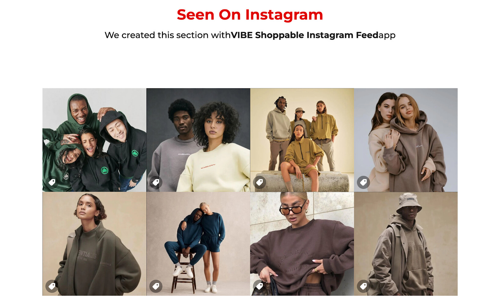
Also, you can consider adding a section for social media, like featuring an Instagram feed, to maintain visibility and engagement with your customers.
Like this:
I hope you’ll find these suggestions useful for boosting your store sales.
Keep up the good work!