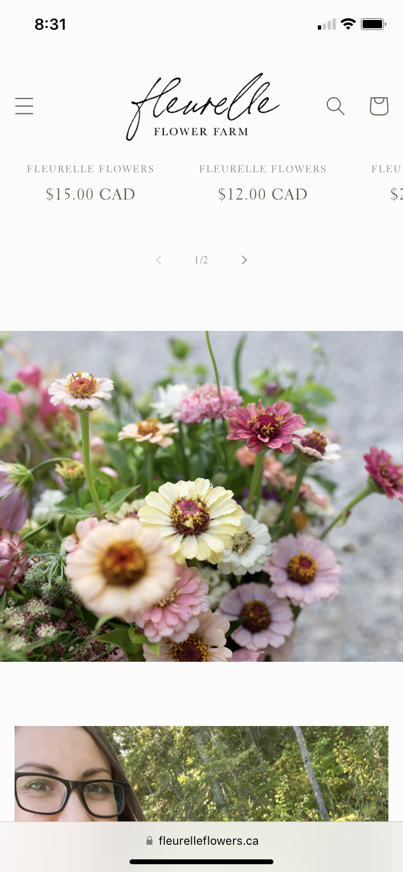
I’m wondering if there is a way to change the size of a second banner on a website for mobile. Currently the second banner is a square regardless of the size I change it to on desktop. I’d like it to be smaller than a square. Thanks!
Link to my shopify website: https://fleurelleflowers.myshopify.com/
Hi
This is Victor from PageFly - Shopify Page Builder App
Please add this code to your base.css file to get this sove
Step 1: Online Stores > Themes > More Actions > Edit code
Step 2: find and click on base.css and paste the code at the bottom of the file
@media screen and (max-width: 767px){
#Banner-template--17308519792962__1a13a93f-37b3-4485-86ef-7ea4a4e11362 .banner__media media {
width: 100%;
height: 300px;
}
.banner__media media > img {
object-fit: contain; // use this in case the image got cropped
}
}
Please change your height px value to match with your requirements.
Hope this can help you solve the issue
Best regards,
Victor | PageFly
Hello @smander
You can follow these steps:
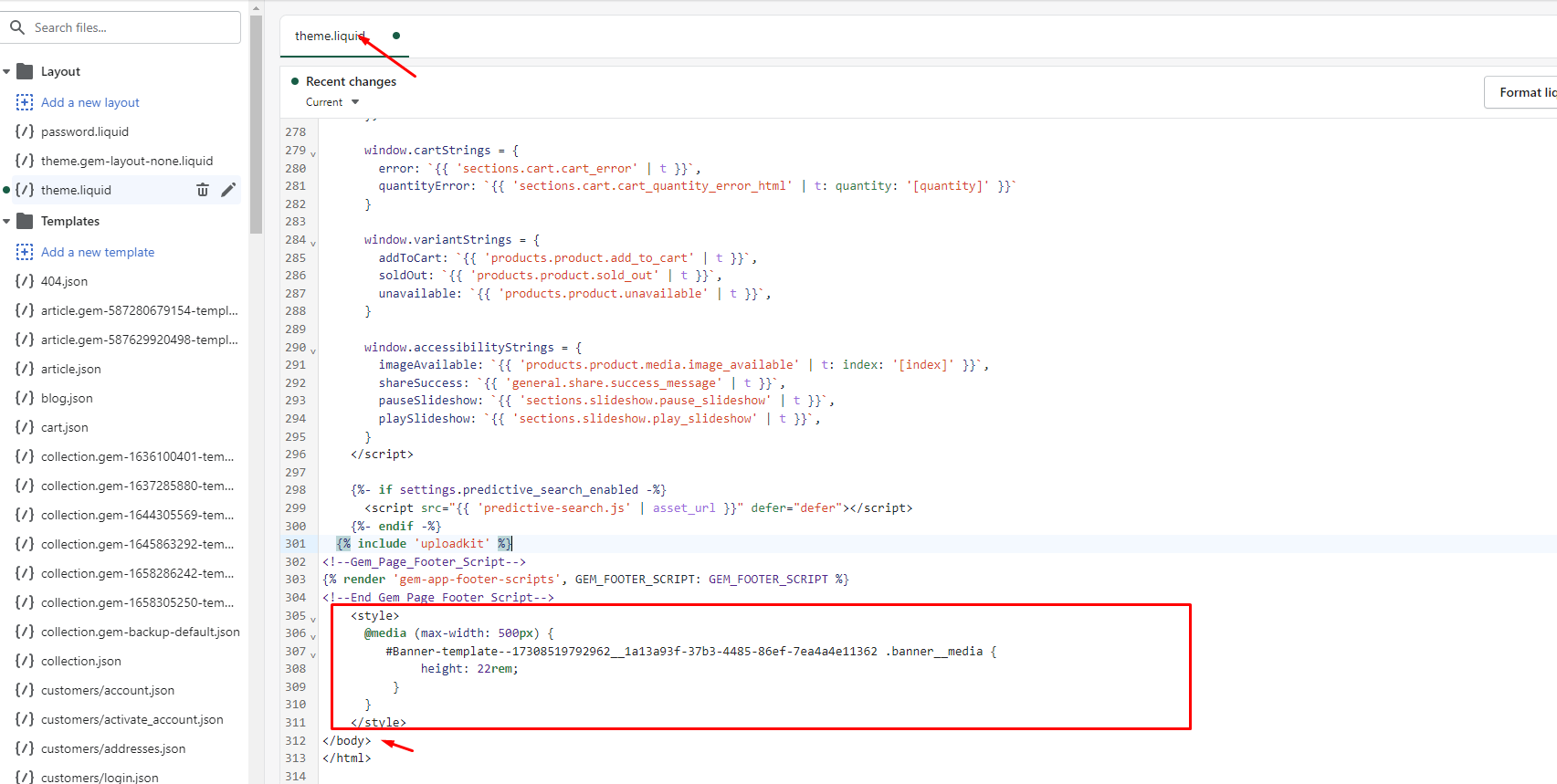
- Go to Online Store->Theme->Edit code
- Open your theme.liquid file, paste the below code before
I hope the above is useful to you.
Kind & Best regards,
GemPages Support Team
@Nicky_bob I noticed that the font is too light on the footer. I haven’t quite figured out how to change it, I can only find how to change the background but I’d really like to darken the font instead