How can I adjust the mobile view size for 'Photo prints' on Sense theme?

Topic summary

Issue: After layout changes to the Shopify Sense theme, the “Photo prints” product page renders too large on mobile, exceeding the screen width.

Context/Evidence:

  • A screenshot was shared to illustrate the oversized mobile view.
  • The site URL (printreality.co.uk) was provided for reference.

Proposed Fix:

  • A respondent suggested adding custom code to the theme.liquid file: Online Store → Theme → Edit code → open theme.liquid → paste code at the bottom → Save.
  • The exact code snippet was not included in the provided content, so the specific CSS/HTML changes are unclear.

Status/Outcome:

  • No confirmation that the issue is resolved.
  • The thread remains open pending an appropriate code snippet and/or user feedback after applying it.

Notes:

  • The fix likely involves responsive CSS adjustments (e.g., mobile-specific styles) applied globally via theme.liquid.
  • The shared image is central to understanding the display problem on mobile.
Summarized with AI on January 3. AI used: gpt-5.

Hi,

I am currently using the ‘Sense theme’ I have changed some of the layout. The issue I am having is that the mobile view for my new product ‘Photo prints’ is to big for the screen, could someone please help with this?

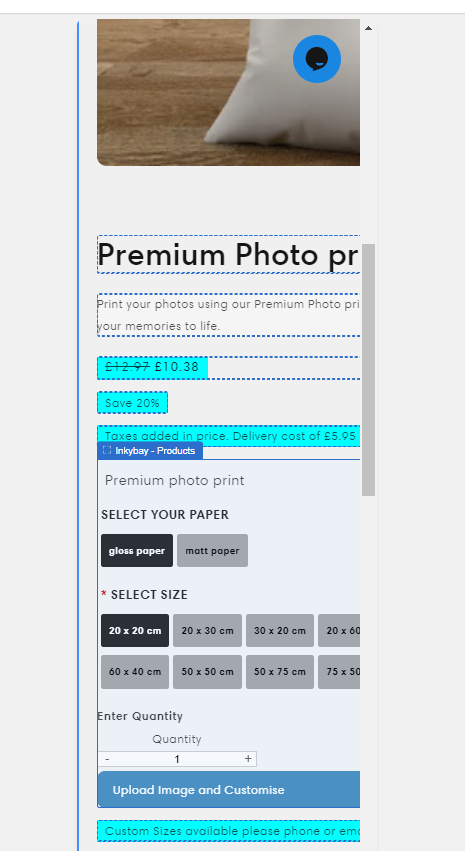
An example is below;

my website is printreality.co.uk

Thanks.

Hi @Printatme ,

You can try this code by following these steps:

Step 1: Go to Online Store->Theme->Edit code.

Step 2: Search file theme.liquid

Step 3: Paste the below code at the bottom of the file → Save


Hope my solution works perfectly for you!

Best regards,

Oliver | PageFly

1 Like