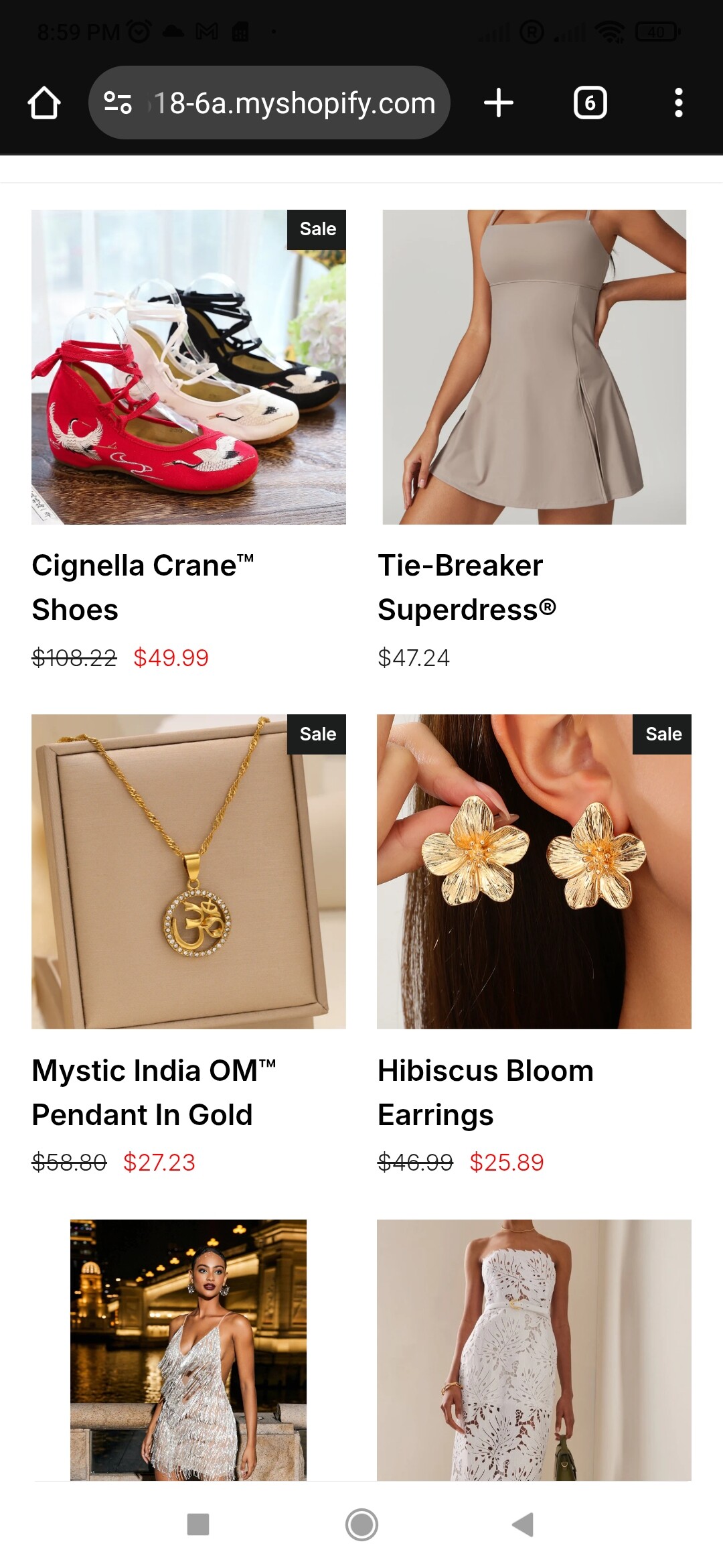
I’ve seen this happen quite a few times with the Impulse theme it’s usually due to inconsistent image aspect ratios (e.g., some are cropped square while others are portrait). The theme grid then tries to align them automatically, but without equal height, they end up looking misaligned.
To fix it without adding more custom CSS, try this quick check:
Go to Online Store - Customize - Collection pages
Under the Product grid section, look for “Image ratio” and set it to Square (1:1) or Portrait (2:3) just make sure all product images follow the same ratio in Shopify’s media.
If your Custom CSS file is already full, you can still add a tiny style override in the theme.liquid footer between <style> tags.
If you’d like, I can take a quick look at your theme structure and alignment settings to match it more precisely to Zekira’s layout sometimes it just needs a few adjustments in the grid-item__content wrapper.
Ah, yep—this is something I deal with all the time. There’s definitely a trick to getting it just right, but don’t worry—I’ve got you. I can handle it for you and save you the hassle.
The code definitely makes a difference towards what I am searching for but still you can see that on the right side the spacing is untouched and also in the left side I think there should be 0.1em spacing to be able to match zekira style which I am looking for. Can we make something about this?
Hey, I like what you did, but I still prefer the look of the Zekira one, and I think we can achieve a similar result. It seems that on both sides, Zekira has around 0.1em spacing, and between the photos, there’s also about 0.1em of space. Could we adjust it to match that style, please?
I used this parameters @media only screen and (max-width: 768px) { .grid__item {padding-left: 2px !important;} .collection-content .grid{margin-right: -8px;} }


