How can I decrease mobile image size for my website?

Topic summary

  • Goal: Reduce the size of three images/icons on the mobile version of a Shopify storefront (URL and screenshots provided to show layout).

  • Proposed fix: Add a CSS media query for small screens (max-width: 767px) targeting the section’s images (class custom-content__image) and set a smaller width (100px). A media query applies CSS rules only at specified viewport sizes.

  • Result: The images resized correctly on mobile to the desired size.

  • New issue: After resizing, the images are not centered within their grid/block. The poster requested guidance to center them (no centering solution provided yet).

  • Additional request: Another participant asked how to achieve a similar size change on the desktop version (outside the mobile media query).

  • Status: Partially resolved. Mobile resizing works; centering and desktop-specific adjustments remain unanswered/ongoing.

Summarized with AI on February 21. AI used: gpt-5.

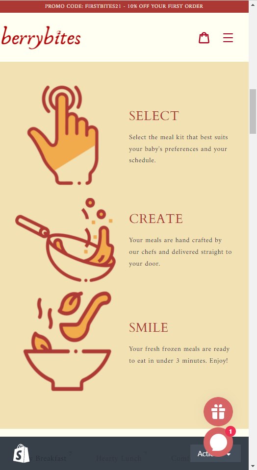
Hello, I’d like help with reducing the size of these 3 images/icons on the mobile version. Thanks in advance!

https://wowberrybites.myshopify.com/

Hi @winnado11

I hope you are doing good !

You can add this code in css file

@media(max-width:767px){
    #shopify-section-1623276090444d7601 img.custom-content__image {
        width:100px !important;
    }
}

Thanks

@hawkscode Thanks for the code. The image does reduce, which is exactly the size I want. However, the problem is that it’s not in the center of its own grid/ block. Do you know how to adjust that to the center?

Thanks for your time and help in advance!

@hawkscode

How can I do it on the desktop version? (not the mobile)