How to display 2 columns on phone when using image column? Help me!
1 Like
website: https://www.donhatnoidia.com/

which section do you want to display in 2 columns?
Section image column. when I switch to mobile version, the columns in each row.
Sorry, my english is not good.
When I use section image column and set layout to 2 columns it only shows on desktop version, but on mobile it shows column by column. So how to make the phone version display like on the desktop.


Please share the page URL
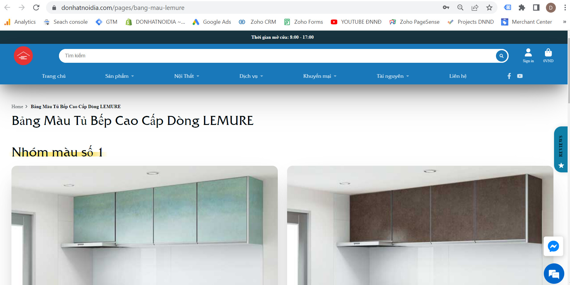
This URL page https://www.donhatnoidia.com/pages/bang-mau-lemure
not working properly please design and send the URL again Please check the following screenshot

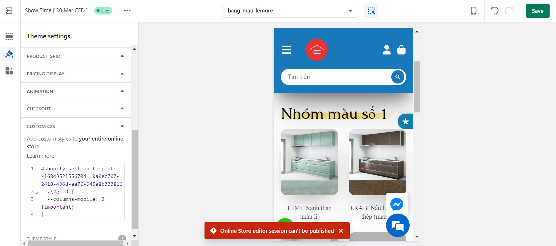
Please add the following CSS code to your assets/core.css bottom of the file.
#shopify-section-template--16843521556704__0a0ec707-2418-436d-aa76-945a8b333816 .\#grid {--columns-mobile: 2 !important;}
Thanks!
1 Like
Is it the add code in this part? I added but it didn’t work.
Could you please guide me in more detail !!

Please add this code to your CSS file only not add a customizer
1 Like
Please check the following link to edit theme code
https://help.shopify.com/en/manual/online-store/themes/theme-structure/extend/edit-theme-code
Please check the following link to edit theme code
https://help.shopify.com/en/manual/online-store/themes/theme-structure/extend/edit-theme-code
1 Like
Ok. Thank You so much!