How would I go about fixing the sizing so all of these categories would be equal? - Beyond Theme
Topic summary
A user is experiencing inconsistent sizing of category elements on their Beyond Theme store, as shown in attached screenshots. The categories appear to have unequal heights or widths, creating a misaligned layout.
Solutions Proposed:
-
CSS modification approach: One responder suggests modifying the
.featured-grid--body--container .featured-grid-itemCSS by changingjustify-self: autotojustify-self: flex-start !importantfor media queries at max-width 767px. -
Theme code editing: The GemPages support team recommends accessing Online Store > Theme > Edit code, opening the theme.liquid file, and pasting custom CSS markup before the
</head>tag.
Both solutions involve CSS adjustments to standardize category element sizing. The issue remains open pending user confirmation of whether either solution resolves the alignment problem.
Hello Kaijann,
It’s shraddha.
This is a design issue. You can solve it by changing some css. Please just change “.Shopify-Text-Column .featured-grid–body–container .featured-grid–item” for media “only screen and (max-width: 767px)” add “justify-self: auto;” instead of “justify-self: flex-start!important;”.
Hope this will work.
Thank you
Hello @Kaijann ,
It’s GemPages support team and glad to support you today.
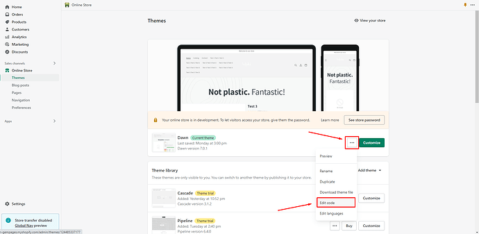
I would like to give you a recommendation to support you so kindly follow steps below:
- Go to Online Store > Theme > Edit code of your current theme
-
Open your theme.liquid theme file
-
Paste the below code before
Let us know how it works for you.
Best regards,
GemPages Support Team


