Hi, is there any way to fix a problem with the wider product page on a mobile device? I think it has to do something with a code for images sliding on product pages. Any help will be appreciated.
This is Victor from PageFly - Shopify Page Builder App, I’d like to suggest this idea:
Add this CSS at the bottom
Online Store ->Theme ->Edit code
Assets ->base.css
body {
  overflow-x: hidden !important;
}
Hope you find my answer helpful!
Best regards,
Victor | PageFly
We have checked for this issue in real system and browserstack but it is working ok. In which system configuration or browser you are checking?
Google Chrome for Iphone and sceenshot is from goodle chrom for Desktop directly in shopify editor.
I dissapeared from desktop editor, but it made no change on Iphone. ![]()
Hello @TMSWLK ,
Glad to support you today.
You can check out my suggestion below to get your concern resolved:
- Go to Edit code on Online Store:
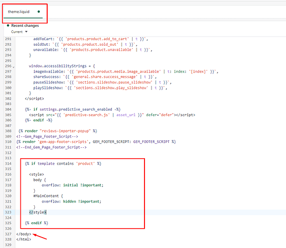
- Add my code above the tag on file Theme.liquid:
{% if template contains 'product' %}

{% endif %}
Eg:
I hope you find the answer helpful.
Kind & Best regards,
GemPages Support Team.
It worked! Thanks so much for your help. ![]()
I am so glad that I my recommendation solution can help ![]() .
.
Hello @TMSWLK ,
As we can check, there is an issue with the “Image with text” sections that you have added to your product page.
If you are using a single section then it will work fine, but using multiple sections creates an overflow issue.
You need to add the below-provided code in your “image-with-text.css” file in the assets folder to resolve the same.
Here are the steps to do the same.
Go to Shopify admin > online store > edit code
Open image-with-text.css from the assets folder
Add the below code in the last
Save the changes
Code:
.image-with-text {
overflow-y: hidden !important;
}
Hope this resolves your issue, do let us know if you have any questions.
All the best,
CedCommerce


