I do know and understand that this topic has been covered a lot of times, but unfortunately my theme seems to differ a little to others.
In the long run I will go ahead and get a premium theme regardless to get some more needed features covered, but In my eyes the shop will need to prove itself first
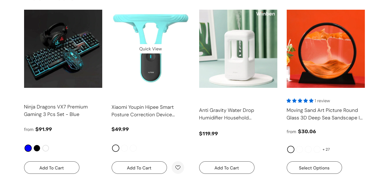
To my problem the add to cart alignment is shocking no matter where if its on the Homepage or collection page
Thats one example not the worst one I myself get dissy going over the page
when I check on the community Board I see that most people just simply add some code to :
Go to Online Store->Theme->Edit code
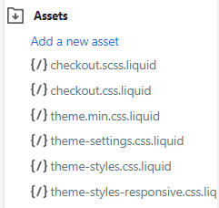
Asset->/theme.scss.liquid->paste below code at the bottom of the file.
Please see my screenshot I don’t seem to have the selection and I tried copying the code in to the styles.css and styles-responsive.css which didn’t help it unfortunately.
.grid__item--collection-template {
margin-bottom: 30px;

.product-card__title {
    min-height: 50px;
    display: block;
}
form {
text-align: center;
}
.btn {
    margin-top: 10px;
}
}

which is the one I found to booth the categories as mentioned, but if you go back on my site:
[www.coolgadgets.site](http://www.coolgadgets.site) you can see that they are still all over the place.

Am I using the wrong code or would there be another solution to the Problem.
Thank you,
Andre
I still haven’t been able to align the damn add to cart and its been really annoying. Please who could help me with that I’m really lost at this stage…