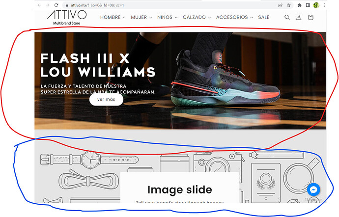
Hello I am trying to hide a section for the mobile version and another section for the desktop and tablet version
what i’m trying to do is make one slideshow appear on mobile and the other on computer and desktop
red color visible on desktop and tablet
blue color visible on mobile
my link https://kvn6yb4906wl3vup-17853927.shopifypreview.com
1 Like
@ATTIVO
i can’t see video please send screenshot section so i will guie you also mention hide mobile or desktop
1 Like
@ATTIVO
can you try this code
- Go to Online Store->Theme->Edit code
- Asset->/base.css ->paste below code at the bottom of the file.
@media screen and (min-width: 750px) {
#shopify-section-template--14221195051102__1651603685282c730b {display: none;}
}
@media screen and (max-width: 749px) {
#shopify-section-template--14221195051102__slideshow {display: none;}
}
1 Like
