How can I improve my new online store's user experience?

Hi everyone,

I hope you’re all doing well. I recently launched my new store on Shopify, and I’m incredibly excited about this venture. As a newcomer to the Shopify community, I greatly value the support and guidance from experienced shop owners like you.

I would be extremely grateful if you could spare a few moments to visit my store and provide some feedback. Your expertise and insights would be tremendously helpful in improving the overall user experience and ensuring that I’m on the right track.

I’ve put a lot of effort into creating a visually appealing and user-friendly store, but I believe there’s always room for improvement. Your constructive criticism, suggestions, or even just a fresh pair of eyes would be incredibly valuable to me.

Here’s the link to my store: Anya Wheeler Design

1 Like

Hi @AnyaWheeler

I am Garcia from PageFly - Shopify Advanced Page Builder App. Congratulations on your new store! From my CRO expertise, I have some feedback for your Store and hope that they can help you increase the design.

1. Have Favicon

A favicon is an opportunity to reinforce your brand identity. By using your logo or a unique icon, it helps users quickly recognize and associate your website with your brand.

A favicon is a small but significant element that contributes to branding, recognition, and a positive user experience. It’s a simple way to add a professional touch to your website.

2. Make sure people can tell what you sell in 5 seconds

In 5 seconds, it is hard to see your brand’s slogan. An attractive hero banner should grab attention, communicate your message effectively, and entice users to take action. Moreover, including CTA button will provide a clear direction to visitors and prompts them to take action, such as making a purchase, signing up, or exploring further

3. Displaying a product list accompanied by clear CTA buttons

Optimizing your product list to a single column on mobile simplifies browsing. Including clear call-to-action buttons enhances the customer journey, increasing conversions. Streamlining the experience removes barriers and improves sales potential.

4. Make Video autoplay

Enabling the auto-play function on your site can enhance user engagement by immediately capturing their attention with dynamic content.

With Father’s Day coming, It is the perfect opportunity to boost your store’s Conversion Rate Optimization (CRO). Let’s check these suggestions out:

  • Run Social Media Campaigns: Utilize social media platforms to create engaging content, run targeted ads, and share compelling visuals and stories related to Father’s Day. Encourage user-generated content and use relevant hashtags to increase visibility.

If you feel my answer is helpful, like it or give it a thumb up. Let me know if you have any questions. Cheers!

Garcia| PageFly team

1 Like

Hello @AnyaWheeler ,

This is Gina from flareAI app helping Shopify merchants get $6Million+ in sales from Google Search, on autopilot.

I’ve taken a look at your store. Nice collection! I’ve some suggestions to increase the conversion rate.

  1. Add favicon to help visitors locate your page easier when they have multiple tabs open. Also it will add overall branding consistency and their absence might be seen as unprofessional.
  2. You can add testimonials on the home page to make the store look more professional. Testimonials allow your satisfied customers to step forward and address the questions and objections that fill the minds of your prospective buyers for you.
  3. Developing an optimal SEO product title and URL can assist search engines in accurately identifying your products and increasing traffic to your online store. Hence, strive to create distinctive and precise product titles and URLs.

Doodle Tote Bag – Anya Wheeler Design 2023-06-16 11-03-20.png

  1. Add detailed filters in collection pages to help your visitors narrow in on the specific product they’re looking for and find products they might be interested in based on certain features (e.g. size, color, category)
  2. Add average ratings for each product
    Including both user rating and number of ratings on the products will help users to make decision whether to buy your product or not.
  3. Add sticky header
    Adding sticky header allow users to quickly access the navigation, search, and utility-navigation elements without scrolling up to the top of the page. They increase the discoverability of the elements in the header and the chance that users will take advantage of them.
  4. Blogging is a great tool to enhance your website’s visibility and online presence, it’s crucial to maintain a consistent blogging schedule and provide engaging content that resonates with your target audience. By doing so, you can increase your website’s organic traffic and improve its online reputation.
  5. Add CTA button like Shop Now, Buy Now in the Home page header banner
    The Call To Action(CTA) is a key element on a webpage, acting as a signpost that lets the user know what to do next. Without a clear CTA, the user may not know the next steps to take to purchase a product or sign up for a newsletter and is likely to leave the site without accomplishing their task.

I hope this is useful.

Gina

1 Like

My heartfelt thanks for taking the time to provide feedback on my store. Your input means the world to me, and I’m truly grateful for your support.

1 Like

A big thank you for sharing your feedback on my store. Your input is incredibly valuable to me, and I can’t thank you enough for taking the time to support me.

Hey @Anyawheeler ,

This is siva gowtham reddy kona from Review My E-Commerce, where we do detailed reviews of shopify stores and e-commerce stores.

Here is the brief review of your store

Homepage Review

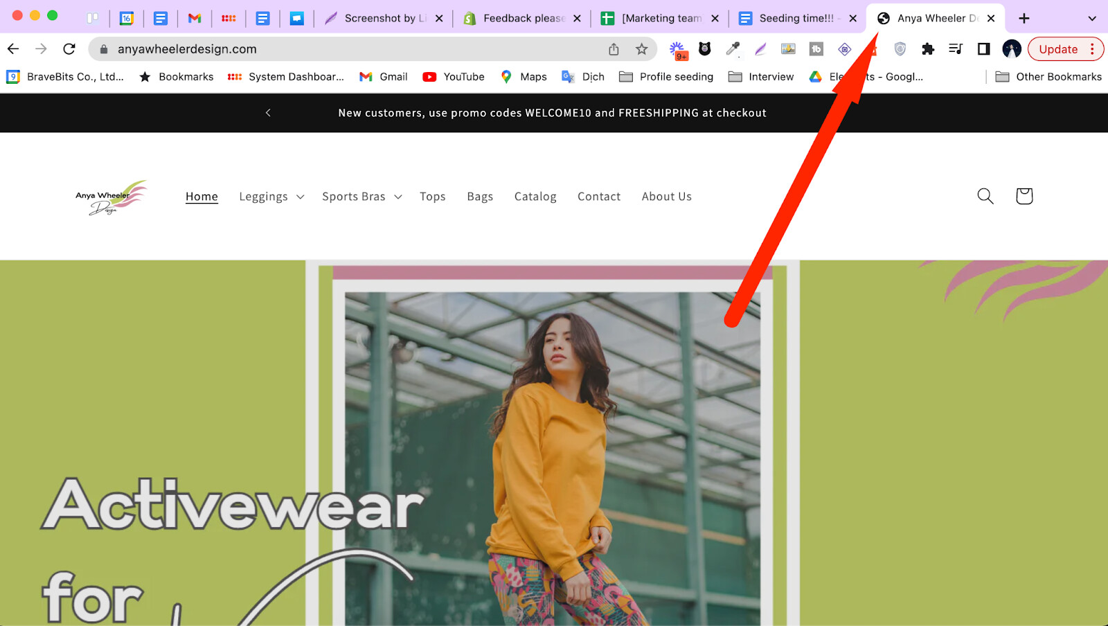
Visually Represent 91% - 100% of Categories on the Homepage (Aim for 31% - 40% at least).

In your online store, on the navigation header of the homepage, there are more than 4 different categories of products available, such as Leggings, Sports Bras, Tops, and Bags. However, these categories are not visually represented on the homepage, making it difficult for consumers to understand what types of products they can find in each category. To improve this, try visually representing at least 31% - 40% of the categories. Since your store only has 4 categories, you can visually represent all of them on the homepage.

To give you an example, you can take a look at Adidas’ website where they have visually showcased the different product categories on their homepage.

![1.png|2000x1031](upload://3Wvevq86dxh4mWbuleSaCevxYu9.jpeg)

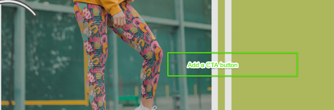
Provide “Thematic or Guided” browsing on the Homepage

On the homepage of the store, it would be beneficial to categorize the products into different themes, such as Abstract Patterns, Flower Patterns, or Plain Designs. This segregation will allow site visitors to navigate through the products more easily and understand what kind of designs they can expect within each theme. By doing this, it will be simpler for site visitors to make decisions about their purchases.

To give you an example, you can take a look at Nordstrom website where they have provided “Thematic or Guided” browsing of Products on the Home Page like Vacation Dresses, Summer Sandals and Everyday Sneakers.

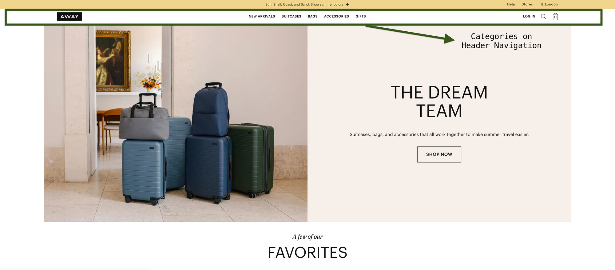
Provide Semantic Sections with Header on Footer

The footer of your store currently lacks links to the categories or sections that are present in the header. It would be beneficial to provide semantic categories in the footer that mirror the ones in the header. This will enable easy navigation for visitors, allowing them to access different sections of the website conveniently.

To give you an example, you can take a look at Awaytravel website where they have provided semantic sections or the same sections of Header on the Footer.

Header

Footer

Product Listing Page Review

Provide Product Attributes on the Product Listing Page’s Product Info

Make an effort to include product attributes in the product information on the product listing page. This will help site visitors understand key details about the product without having to visit the individual product page. By providing these attributes upfront, it will be easier for visitors to get a clear understanding of the product’s important elements.

To give you an example, you can take a look at Nordstrom website where they have provided the Product Attributes in the Product Info Section of the Product Listing Page.

Add Product Ratings to the Product Info section of the Product Listing Page or a Disclaimer of Zero Ratings if no ratings are available.

Make an effort to display product ratings in the product information section of the product listing page. This way, site visitors can easily see the average ratings of each product without having to visit the individual product detail page. In the event that no ratings are available for a product, include a disclaimer indicating zero ratings. This will provide transparency to users and set their expectations accordingly.

To give you an example, you can take a look at Nordstrom website where they have provided the Product Ratings in the Product Info Section of the Product Listing Page.

Provide a Quick View of the Product

Make an effort to incorporate a Quick View feature on the product listing page. This will allow visitors to conveniently examine the product in detail without having to navigate to the individual product detail page. By providing this quick glimpse, you can help reduce the time it takes for visitors to make a decision about the product.

To give you an example, you can take a look at Nordstrom website where they have provided a Quick View of the Products in the Product Listing Page.

Product Detail Page Review

Provide FAQs or Q&As on the Product Detail Page

Consider including Frequently Asked Questions (FAQs) or a section for Questions and Answers (Q&A) on the product detail page. This will make it easier for site visitors to access additional information about the product, particularly if they have common questions or inquiries. By providing these FAQs or Q&As, you can address potential concerns and help visitors gain a better understanding of the product.

To give you an example, you can take a look at Colehaan website where they have provided Q&As and FAQs about the Product on the Product Detail Page.