Hi @NanasBedBuddies
Great job! I must say, it’s really impressive, my friend. However, there might be a few areas we could fine-tune to make it even more valuable. Let’s explore these points together. I’m Garcia, from the PageFly team.
- Review your Brand Identity, especially boost visual on all touch points
- Redesign the logo, recommend to use Logo with transparent background, which will be better to use everywhere in your website, even with the package. A transparent logo can be easily placed on any background without the need for additional design adjustments. This flexibility simplifies the design process and allows for more creative freedom in layout and composition.
- Choose the most attractive font for the Headline, and another easy-to-read for Paragraph.
- Review Conversion-Rate-Optimization Elements in your page
a. Reduce the height of the Header:
- A tall header pushes essential content below the initial viewport, requiring users to scroll down to reach it, which increase your interaction cost
- A long header can make the page appear more intimidating and time-consuming to navigate. This can discourage users from engaging with the content and potentially lead to higher bounce rates.
b. Put the promotion on Announcement bar, and stick the bar on the head
- Make the announcement bar be sticky
- Promotion content with countdown timers should be put here, creating a sense of urgency, encouraging visitors to take action before the deal expires.
c. Redesign Hero Banner
- Add featured product images in the hero banner. The hero banner is the first thing visitors see upon landing on your website. Featuring high-quality product images in this prominent position instantly captures their attention and entices them to explore further.
- Add the CALL-TO-ACTION button here. Well-crafted CTA buttons often incorporate language that conveys a sense of urgency, such as “Limited Time Offer” or “Don’t Miss Out.” This urgency can motivate visitors to take action before the opportunity passes, leading to increased conversions.
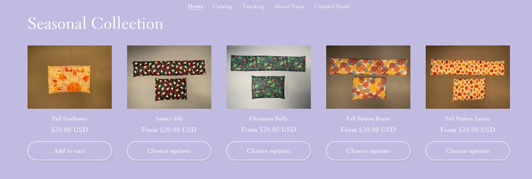
d. Choose other dark color, instead of white. Not use the Light purple and White
- High-contrast colors create a less visually fatiguing experience for users, making it easier for them to scan the page and identify the CTA button. This reduced visual fatigue helps maintain visitors’ engagement and increases the likelihood of them taking the desired action.
- Low-contrast color combinations make it difficult for users to distinguish between the foreground and background elements, leading to poor readability and reduced visibility of important information
- Below is the contrast point of 2 colors you did use:
e. Add testimonial section
f. Do not use ACCORDION for benefit section. Use the layout as below is proved to deliver higher sales
- Invest more in qualify the image system
a. Fix a few locations where you place the product and take photos of it. They need to be synchronized in context and lighting. Maintaining a consistent visual aesthetic across product placements and photos creates a sense of cohesion and professionalism.
b. Add in-use photos: Placing product photos in relevant contexts allows customers to envision how the product would look or function in their own lives. This contextual relevance can spark interest and encourage purchase decisions.
c. Add ALT Text for each image: Alt text helps search engines understand the content and context of images, increasing the likelihood of your images appearing in relevant image search results. This can drive more traffic to your website and potentially lead to more conversions.
d. You can get familiar with reaching customers through short videos, add short videos into your page. In fact, studies have shown that short videos have a higher engagement rate than any other type of content on social media. This is because short videos are able to capture people’s attention quickly and effectively, and they can also convey a lot of information in a short amount of time.
a. Interactive elements: Add interactive elements like quizzes, polls, or fun holiday-themed games to engage visitors and keep them on your site longer.
b. Holiday specials and offers: Offer exclusive holiday promotions, discounts, or special deals to entice customers. Highlight these offers prominently on your website to catch the attention of potential buyers.
Hope it helps,
Garcia