hello all please review my site
the link is:
Hi, @A-Mart .
Thank you for reaching out and providing your URL.
Your store looks great and has a lot of cool products. I would be happy to review your store and offer you feedback. What type of feedback are you looking for?
Please let me know if you have any further questions!
Talk soon,
Hello thanks for the quick reply I just want feedback such as why I am getting allot of traffic but no sales and also just feedback to improve the product description, images and the overall layout where this and that goes etc
Look forward to hearing your reply
Thank you
Hi, @A-Mart .
Thank you for your reply!
Your store looks great but I think I found why you have not had any sales. When I go add a product to my cart, I do not see a cart icon at the top corner so there isn’t a way for me to checkout. Have you recently made changes to your theme code or added a third-party app?
Please let me know if you have any further questions!
Talk soon,
Hi @A-Mart ,
I’m Garcia from PageFly - Shopify Advanced Page Builder App. From my CRO expertise, I’d love to give you my suggestions as hereby:
1. Make the header sticky
If your website visitors are looking for a particular product while browsing, what’s the usual action they would take? They might have to scroll all the way up to the page’s top in order to find the search bar, which can be a bit of an inconvenience. However, this issue can be addressed by introducing a sticky header, significantly improving the ease of navigation for your customers
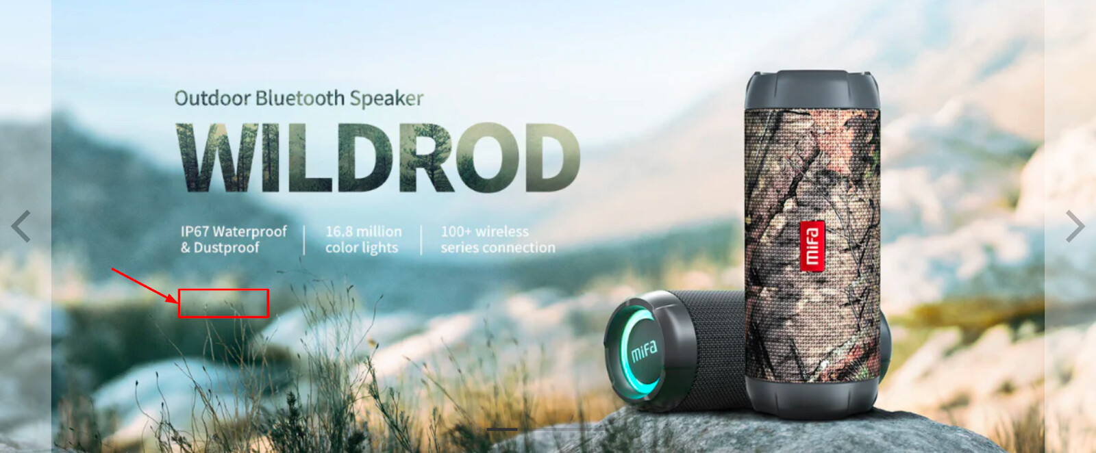
2. Change hero banner
The banner will create the very first impression on your visitor as it is the first thing customers see when they visit your website. It’s great when your current hero banners can describe exactly what you’re selling in 5 seconds first.
But please recheck the image quality to make sure they are clear to be seen on any devices.
3. Place a CTA button on each banner
A crucial element for an online store’s homepage is the primary call-to-action button. This button serves as a direct link to the specific page where you want customers to take action, such as a collection or product page.
Not having a “Shop now” button on your banner is a missed opportunity. A well-placed call-to-action button encourages visitors to make a purchase and is an effective strategy for enhancing your homepage.
Additionally, it’s important to maintain consistent styling for all call-to-action buttons to maximize the conversion rate.
4. Adjust text line reasonably
You should keep the text of one sentence in the same line if possible to keep the information more seamless.
5. Increase the spacing among sections
This is to avoid making the content easily overlooked
6. Color swatch
Product color swatches enhance conversion rate by reducing the number of clicks for customers to find the product they want. So it’s very great when you use swatches:
But it does not work so you should recheck this part.
7. Get prepared for Chirstmas
As the holiday season approaches, let’s take a look at these expert insights to further enhance your holiday preparations.
App: Install apps like “Snowfall Effect” or “Nexa Snow Effect” to add animated snowfall or other holiday effects to your website.
Customization: You can also use HTML and CSS to create custom holiday animations or effects on your site.
And that’s my feedback! Hope it helps you boost the conversion rate.
Cheers!
Garcia | PageFly Team