How can I improve the mobile view of my image with text section?

Hello. I add to my home page “image with text” Section.

I want display 1 image left text right and 1 image right text left.
It is display very pretty dekspot version. But when i click mobile version it is very ugly display. I want show my mobile version automatic image top and text bottom from image. I open “text with image.liquid” but i do not know which code i edit it display dekspot version left right and mobile version top bottom. I use premium thema i do not want change my total thema. Anyone can help me?


?

HI @zamanhasanov96 ,

Please share your store URL and if your store is password protected then please provide password too.

So that we can help you.

Thank you.

I do not publish ghema it is draft status

{% if section.blocks.size > 0 or section.settings.dpl_blog_custom %}
{% if section.settings.dpl_blog_custom %}

{% for block in section.blocks %} {% if block.type == 'largeImg' %}
{% if block.settings.image != blank %} {%- assign preview_img = block.settings.image -%} {%- assign img_url = block.settings.image | img_url: 'original', crop: 'center' -%} {{ block.settings.image.alt | default: shop.name }} {% else %}
570 x 780px
{% endif %}
{% if block.settings.banner_heading != blank %}

{% render 'multilang' with block.settings.banner_heading %}

{% endif %}

{% if block.settings.banner_des != blank %}

{% render 'multilang' with block.settings.banner_des %}

{% endif %}

{% if block.settings.banner_button != blank %}

{% render ‘multilang’ with block.settings.banner_button %}

{% endif %}

#custom-block-item-{{block.id}} .banner-content .banner-button.button_2 span{ background-image: linear-gradient(#fff 97%, {{ block.settings.color_banner_button }} 3%); } .blog-detail-custom-block .container #custom-block-item-{{block.id}} .banner-content .banner-button.button_2:hover{ color: {{ block.settings.color_banner_button }} !important; } .blog-detail-custom-block #custom-block-item-{{block.id}} .banner-content h2 span{ background-image: linear-gradient(#fff 97%, {{ block.settings.color_banner_heading }} 3%); }
{% endif %}

{% endfor %}

{% assign image_url1 = section.settings.image1 | img_url: '2000x' %} {% assign margin_bottom = section.settings.margin_bottom %}

[email removed] (max-width: 1024px){
.blog-detail-custom-block .container .blog-item:last-child .banner-content .banner-desc{
font-size: 30px !important;
}
}

[email removed] (max-width: 768px){
.blog-detail-custom-block .container .blog-item:last-child .banner-content .banner-desc{
font-size: 24px !important;
line-height: 38px;
}
.blog-detail-custom-block .container .blog-item:last-child .content-image{
margin-top: 0;
}
}

[email removed] (max-width: 767px) {
#custom-block-{{ section.id }} {
margin-bottom: {{ section.settings.margin_bottom_mb }}px;
}
}

[email removed] (max-width: 480px){
.blog-detail-custom-block .container .blog-item:last-child .banner-content .banner-desc {
font-size: 16px !important;
line-height: 28px;
margin-top: 20px !important;
}
.blog-detail-custom-block .container .blog-item:last-child .banner-content {
margin-bottom: 76px;
}
.blog-detail-custom-block .container .blog-item .banner-content .banner-button{
min-width: 100%;
}
}
[email removed] (max-width: 320px){
.blog-detail-custom-block .container .blog-item:last-child .banner-content .banner-desc {
font-size: 14px !important;
}
.blog-detail-custom-block .container .blog-item .banner-content .banner-button.button_2 span {
background-position-y: -2px;
}
.blog-detail-custom-block .container .blog-item .banner-content .banner-button.button_2{
overflow: hidden;
margin-top: 25px;
}
}

[email removed] (min-width: 768px) and (max-width: 1199px) {
#custom-block-{{ section.id }} {
margin-bottom: {{ section.settings.margin_bottom_tab }}px;
}
}

[email removed] (min-width: 1200px) {
#custom-block-{{ section.id }} {
margin-bottom: {{ margin_bottom }}px;
}
{% if section.settings.image1 != blank %}
#custom-block-{{ section.id }} {
margin-bottom: {{ margin_bottom }}px;
background-image:url({{image_url1}});
background-repeat: no-repeat;
}
{% endif %}
}

{% endif %}
{% endif %}

{% schema %}
{
“name”: “Custom Block Middle”,
“class”: “home-custom-block-middle-banner-sections”,
“max_blocks”: 2,
“settings”: [
{
“type”: “header”,
“content”: “Custom Block Middle Banner”
},
{
“type” : “checkbox”,
“id” : “dpl_blog_custom”,
“label” : “Enable”,
“default” : true
},
{
“type”: “image_picker”,
“id”: “image1”,
“label” : “Select Background Image”
},
{
“type”: “header”,
“content”: “Margin Bottom:”
},
{
“type”: “range”,
“id”: “margin_bottom_mb”,
“label”: “Mobile”,
“min”: 0,
“max”: 100,
“step”: 1,
“default”: 25
},
{
“type”: “range”,
“id”: “margin_bottom_tab”,
“label”: “Tablet”,
“min”: 0,
“max”: 100,
“step”: 1,
“default”: 30
},
{
“type”: “range”,
“id”: “margin_bottom”,
“label”: “Desktop”,
“min”: 0,
“max”: 100,
“step”: 1,
“default”: 30
}
],
“blocks”: [
{
“type”: “largeImg”,
“name”: “Block Image”,
“settings”: [
{
“type”: “image_picker”,
“id”: “image”,
“label” : “Select Image”
},
{
“type”: “header”,
“content”: “Banner Content”
},
{
“type”: “select”,
“id”: “alignment”,
“label”: “Text alignment”,
“default”: “left”,
“options”: [
{
“value”: “left”,
“label”: “Left”
},
{
“value”: “center”,
“label”: “Center”
},
{
“value”: “right”,
“label”: “Right”
}
]
},
{
“type” : “text”,
“id” : “banner_heading”,
“label” : “Banner Heading”,
“default” : “Metropolis”
},
{
“type” : “text”,
“id” : “font_size_banner_heading”,
“label” : "Heading Font Size ",
“default” : “24px”
},
{
“type” : “color”,
“id” : “color_banner_heading”,
“label” : “Heading Color”,
“default” : “#0f0f0f”
},
{
“type” : “textarea”,
“id” : “banner_des”,
“label” : “Banner Description”,
“default”: “Pellentesque posuere orci lobortis scelerisque blandit. Donec id tellus lacinia an tincidunt risus an consequat delit quisquemos.”
},
{
“type” : “text”,
“id” : “font_size_banner_des”,
“label” : “Description Font Size”,
“default” : “12px”
},
{
“type” : “color”,
“id” : “color_banner_des”,
“label” : “Description Color”,
“default” : “#5f5f5f”
},
{
“type” : “text”,
“id” : “banner_button”,
“label” : “Button Banner”,
“default” : “Shop Now”
},
{
“type” : “url”,
“id” : “link”,
“label” : “Banner Link”
},
{
“type” : “color”,
“id” : “bg_banner_button”,
“label” : “Background Button”,
“default” : “#e95144”
},
{
“type” : “color”,
“id” : “border_banner_button”,
“label” : “Border Button”,
“default” : “#e95144”
},
{
“type” : “color”,
“id” : “color_banner_button”,
“label” : “Button Color”,
“default” : “#fff”
},
{
“type”: “select”,
“id”: “button_style”,
“label”: “Button Style:”,
“options”: [
{
“value”: “style_1”,
“label”: “Style 1”
},
{
“value”: “style_2”,
“label”: “Style 2”
}
],
“default”: “style_1”
}
]
}
],
“presets”: [
{
“name”: “Custom Block Middle Banners”,
“category”: “Banner”,
“blocks”: [
{
“type”: “largeImg”
},
{
“type”: “largeImg”
}
]
}
]
}
{% endschema %}

Hi @zamanhasanov96 ,

You can share the preview link of the theme you want to edit with us

Thanks you

https://eycuf.com/?_ab=0&_fd=0&_sc=1

My problem only with mobile.In dekspot version is excellent. But I only want mobile version display image top and text bottom. Not display image and text left right in mobile version. It is very ugly show. Thank You

Hi @zamanhasanov96 ,

Can you send a link with this part? We checked the homepage and can’t find the part you want to edit

Thanks you

Becuse ı share preview link. Tema is draft status now

I can not publish my thema becuse ı running now ads company. How ı share draft thema link with you

I open a new store for you

peycuf.myshopify.com

parol: sawxia

Hi @zamanhasanov96 ,

You can follow the instruction below:

  1. Go to Online Store->Theme->Edit code
  2. Asset->/theme-styles.css->paste below code at the bottom of the file:
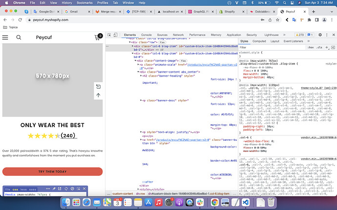
@media (max-width: 767px) {
.blog-detail-custom-block .blog-item {
    -ms-flex: 0 0 100%;
    flex: 0 0 100;
    max-width: 100%;
    margin-bottom: 40px;
}
.blog-detail-custom-block .blog-item .content-image {
    flex-direction: column !important;
}
.blog-detail-custom-block .container .blog-item:last-child .content-image > a {
    margin-bottom: 20px;
}
}

If you feel like my answer is helpful, please mark it as a SOLUTION. Let me know if you have any further questions.

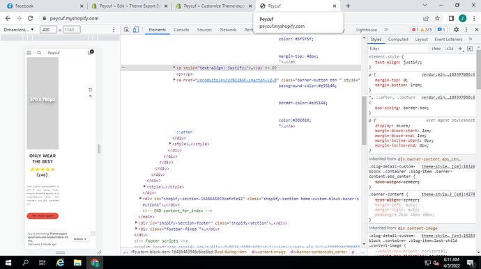
Thank You For Help Me. it is work. Text be in bottom. But mobile right display have very great ugly “space”. I add screenshot

If i remove right “Space”. It is be excellent

Hi @zamanhasanov96 ,

Can you share the source code that got this error? I tried more on the demo you sent without this problem

Thanks you

I copy paste your code and I test very device diamension but see a big space in the right

Hi @zamanhasanov96 ,

You can try below code in theme-styles.css file:

@media (max-width: 767px) {
.blog-detail-custom-block .blog-item {
    -ms-flex: 0 0 100%;
    flex: 0 0 100%;
    max-width: 100%;
    margin-bottom: 40px;
}
.blog-detail-custom-block .blog-item .content-image {
    flex-direction: column !important;
}
.blog-detail-custom-block .container .blog-item:last-child .content-image > a {
    margin-bottom: 20px;
}
}

If you feel like my answer is helpful, please mark it as a SOLUTION. Let me know if you have any further questions.

GRAT. THANK YOU VERY MUCH. IT IS WORK. VERY THANK

1 Like