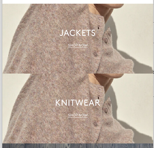
Hi guys,
The image height is tiny on mobile and crops the image horribly. How do I increase the image height for mobile only? We’re happy with the way it looks on desktop.
{% if section.settings.image_1 == blank %}
{{ 'lifestyle-1' | placeholder_svg_tag: 'placeholder-svg' }}
{% endif %}
{% if section.settings.title_1 != blank %}
{{ section.settings.title_1 | escape }}
{% endif %}
{% if section.settings.text_1 != blank %}
{{ section.settings.text_1 }}
{% endif %}
{% if section.settings.button_label_1 != blank and section.settings.button_link_1 != blank %}
{{ section.settings.button_label_1 | escape }}
{% endif %}
{% if section.settings.image_2 == blank %}
{{ 'lifestyle-1' | placeholder_svg_tag: 'placeholder-svg' }}
{% endif %}
{% if section.settings.title_2 != blank %}
{{ section.settings.title_2 | escape }}
{% endif %}
{% if section.settings.text_2 != blank %}
{{ section.settings.text_2 }}
{% endif %}
{% if section.settings.button_label_2 != blank and section.settings.button_link_2 != blank %}
{{ section.settings.button_label_2 | escape }}
{% endif %}
1 Like
@aliceECOD
Welcome to the Shopify community!
Thanks for your good question.
Please share your store URL.
So that I will check and let you know the exact solution here.
1 Like
@aliceECOD
Add this code in the bottom of theme.css or theme.scss file.
@media only screen and (min-width: 600px) {
div#shopify-section-1649648988d19e8369.double-hero .hero--large {
    height: 586px !important;
}
}
Added to bottom of theme.scss.liquid file but that doesn’t seem to have done anything …
@aliceECOD
@media only screen and (max-width: 600px) {
.hero.hero--large.box.ratio-container.js.lazyloaded{
    height: 586px !important;
}
}
try out this.
Hey @Zworthkey , this didn’t do anything either… sorry!
1 Like
Hey @Zworthkey - this didn’t fix the issue on Mobile however it hid the second image on desktop.
@aliceECOD
@media only screen and (max-width: 600px) {
.hero.hero--large.box.ratio-container.js.lazyloaded{
    height: 586px !important;
}
}
1 Like
@Zworthkey thanks for sticking with me.
This hasn’t worked either  didn’t do anything
sorry @Zworthkey - It has worked (showing correctly on Mobile)
however now it is only showing only one image on desktop, and it’s showing both images but cropped on Tablet …any ideas?
@aliceECOD
@aliceECOD
@media only screen and (min-width: 1200px){
.hero.hero--large.box.ratio-container.js.lazyloaded {
    height: 586px !important;
}
}
@Zworthkey have pasted this in. We are back to the same issue. Images cropped weirdly on Mobile + Tablet 


