I have two (image with text ) sections on my home page. The first section has the image on the left and the text box to the right. The second (image with text) section at the bottom of the page, has the image on the right and the text box to the left. This layout works for desktop view. However on a mobile, the image and text box becomes stacked, for both of them. How can i keep both sections with the same alignment as the desktop view?? Also, i do not have the theme.scss so I am not sure where to paste the code as i have tried before
Hey @AlexDaSilva ,
First, can you share the link to your store?
Next, Having side by side views on mobile is not a good idea because phones are generally small and you won’t be able to see them properly if they are side by side.
You will see the two sections that are stacked (The shop by concern blue section) and the (shop lip treatments red section)
Try this and see
Go to your theme’s “Edit Code” Option, then in the search bar type “theme.liquid”
Below the tag “” tag paste the following. Screenshot attached for reference.
Screenshot is for reference only, the correct code to paste is the one shown above.

This worked perfectly! Thank you so much I appreciate it more than you know 
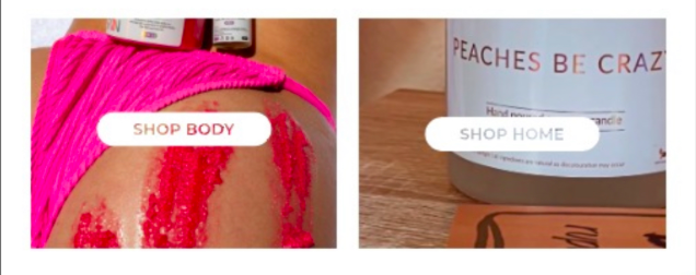
Could i ask for your help with one more aspect please? The two images on the page in between the sections we just edited, on both desktop and mobile they are stacked on top of each other. Is there any way to have those two image sections next to each other both on desktop and mobile layout? Thanks!
Like this (see image below). I’m not sure how to get the white boarders around the images as they are full width/screen elements
Hey @AlexDaSilva ,
Last one bro. The above one was already very exhausting to think and write.
Steps as same as above.
Perfect! Thanks so much It all worked