Hi community!
I am working on adding a single collection on my page (TRADE THEME), but it makes it soooo big! How can I scale this down? (fyi, i’ve tried the adapt to first image, small, medium, large options but all come out big  )
)
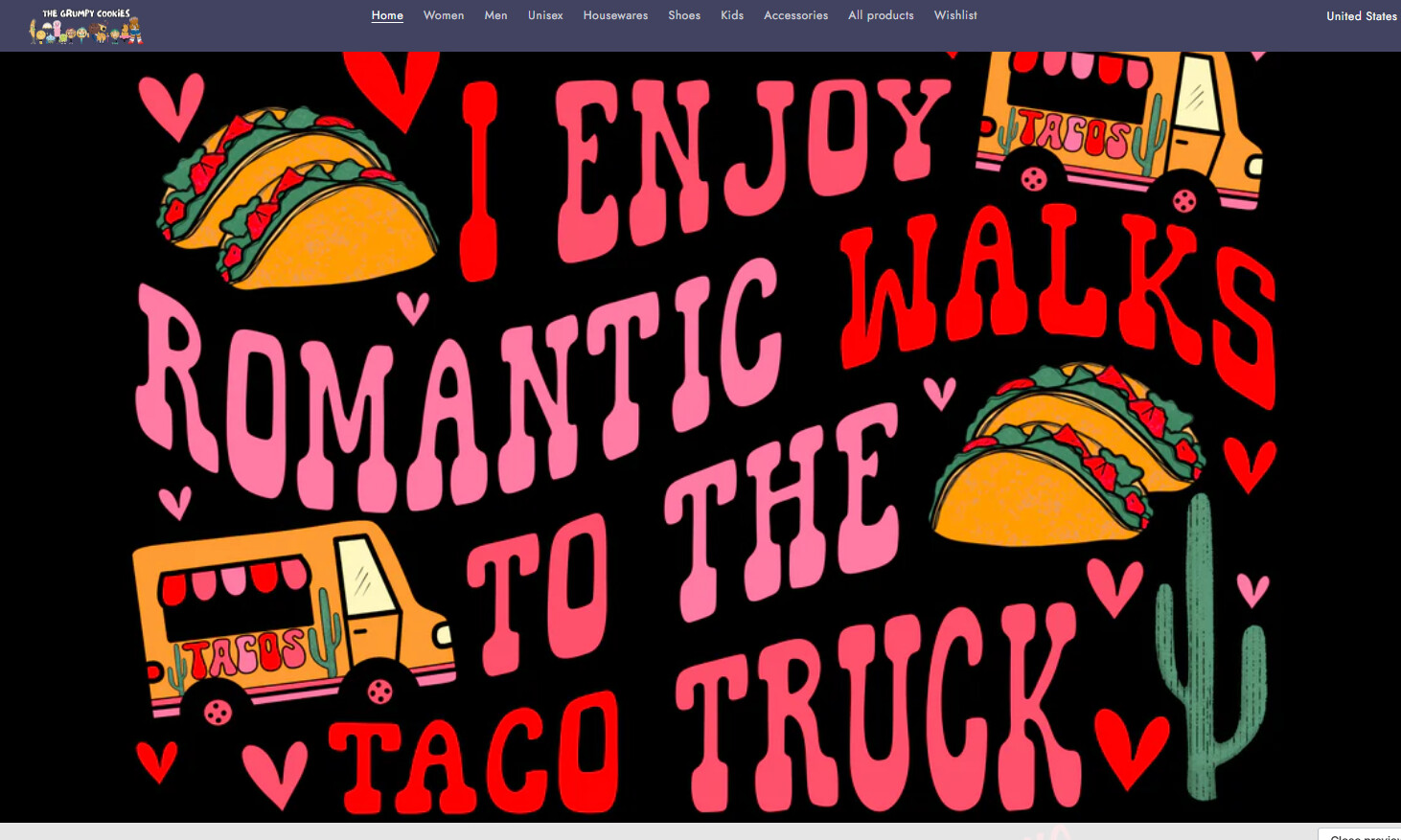
On mobile, it looks pretty good, but it’s the desktop version that’s too ginormous. Helps!
Here is the preview link, since I’m still working on fixing things up. https://m1vxiidlhaedu4jq-77911654695.shopifypreview.com
desktop view
mobile view
1 Like
Hi @grumpycookies
Try this one.
- From your Shopify admin dashboard, click on “Online Store” and then “Themes”.
- Find the theme that you want to edit and click on “Actions” and then “Edit code”.
- In the “Assets” folder, click on “base.css, style.css or theme.css” file, depending on which file your theme uses to store its CSS styles. At the bottom of the file, add the following CSS code:
@media only screen and (min-width: 749px) {
.card-wrapper.animate-arrow.collection-card-wrapper .card__inner {
    width: 30%;
    margin: auto;
}
}
Your Feedback Matters! Please mark the solution and give likes to posts that helped you. Your appreciation fuels our motivation to assist you better!
@Made4uo-Ribe
thank you so much for the code! it 50% worked 
it did make that category pic smaller, but it also did it for the rest of the categories 
the valentine’s day category is in its own section, so not sure how it made the other section smaller also. here is a pic. could this be fixed? i did change the % from 30% to 75% which did make the circle categories bigger but also the valentine one. aaah.
Please, replace on this code.
@media only screen and (min-width: 749px) {
.section-template--23830794043687__collection_list_XGbA7M-padding .card-wrapper.animate-arrow.collection-card-wrapper .card__inner {
    width: 50%;
    margin: auto;
}
}
And Save.
Result:
Please don’t forget to Like and Mark Solution to the post that helped you. Thanks!