A user seeks to make collection photos display at full width on their Shopify store, specifically removing white space on the right side of the BESTSELLERS collection and other collection pages.
Initial Solution:
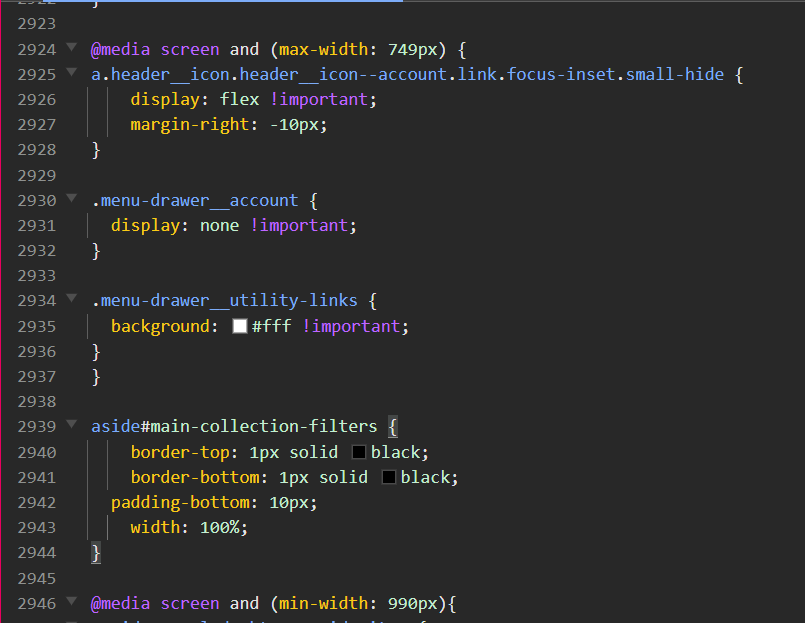
A community member provides CSS code to add to the theme’s base.css/style.css file
Code targets .collection.page-width and .grid--4-col-desktop elements to achieve 100% width
Solution works initially for mobile but requires additional adjustments for desktop
Ongoing Issues:
Desktop filter borders: Black border lines appear around sort/filter elements on desktop (not mobile), requiring CSS bracket corrections
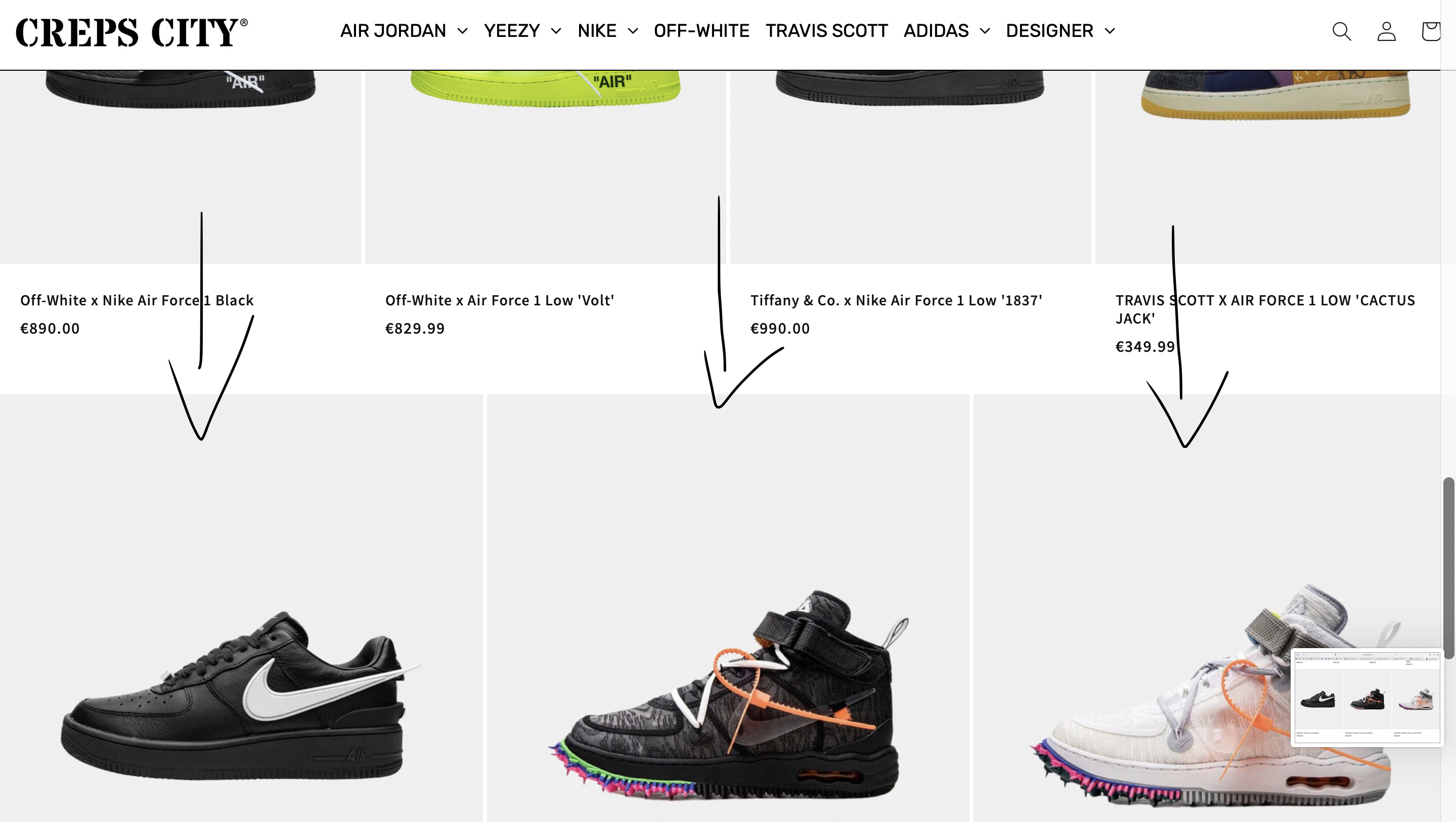
Featured collections: Full-width code doesn’t apply to featured collections (e.g., Louis Vuitton Outerwear, Dior Sneakers), only product grid collections
Image sizing problem: Last 1-3 products in each collection row display as oversized images on desktop after applying the full-width code. This occurs when the final row has fewer products than the number of columns
Current Status:
User repeatedly requests help fixing the enlarged last-row images and making featured collections full-width on mobile
Discussion remains open with unresolved issues despite multiple follow-ups
Additional CSS snippets provided for slider components, but core image sizing problem persists
Summarized with AI on November 9.
AI used: claude-sonnet-4-5-20250929.
I want the BESTSELLERS collection to use full width. There is a small white space left on the right side. Please help me fix this. I want it for all collections on the page if I add more products.
From your Shopify admin dashboard, click on “Online Store” and then “Themes”.
Find the theme that you want to edit and click on “Actions” and then “Edit code”.
In the “Assets” folder, click on “base.css, style.css or theme.css” file, depending on which file your theme uses to store its CSS styles. At the bottom of the file, add the following CSS code:
Hi, i added the above code and it worked for mobile version only however, i would like desktop version to have the full width too. Can you please guide me how i can include this for desktop version please. Also, for mobile version its only full width from left to right and not full width on top, there is still a white gap in between the product collection and sort by/filters?
Which collection you like to full width? Is it in the collectins pages?
check this one.
From your Shopify admin dashboard, click on “Online Store” and then “Themes”.
Find the theme that you want to edit and click on “Actions” and then “Edit code”.
In the “Assets” folder, click on “base.css, style.css or theme.css” file, depending on which file your theme uses to store its CSS styles. At the bottom of the file, add the following CSS code:
Hi, it worked perfectly after i put the code into theme.liquid and it aslo resolved the white gap in between the collection page products and sort by/filters.
But i have an issue with sort by/filters for *desktop version only. On mobile view, when you click any product collection you can see where it says sort by and around it there are two black boarder lines which i added code for however, these two boarder lines only show on mobile version only and not on desktop which i would like to implement also. I have shared the photos below. Again thank you in advance.
Hi, WOW! thank you. It worked perfectly. However i can observe in the product collections there all full width as i wanted but if you click into DESIGNER → Louis Vuitton Outerwear OR Dior → Sneakers, these are not product grid collection and they are featured collections therefore, the code you provided to make all product collections full width did not trigger the featured collection which is the reason why they are not full width. What code should i add to make featured collection full width?
Hi again, i have noticed on all my product collection for desktop version only that every last 1-3 products are huge images which shouldn’t be like that and they where all normal portrait sizes. I think one of the codes you shared had caused to trigger this. can you please review this.
If you assign them on the normal sizes. When you max-width the sections normally the sizes will bigger, the image occupy all the available left and right spaces so it zoom.
Hi, thank you for the info. Im still kinda confused in regards to the image size cause ive deselected the max width and all the top and middle products are perfect sizes however, the last 1-3 products on each collection are too big So, how do i put the product images back to normal as they where normal before cause this happend when i added one of the codes above?
to explain it better. The product grid, in Dawn. For example, in the collections pages, if the number of products in the last row is not equal to the number of columns, the image displays at the full width of the page, instead of sticking to the same format of all the other images. See the screenshot attached below again.
Hi. aslo i can observe that the code provied by you in regards to making featured collections full width only worked for *desktop version only and did not trigger mobile version?
Hi again, i really need help to have this resolved as soon as possible as the product collection images on the last (1-3) rows are large, as it was not displaying like this before i entered the code you provided me. Please tell me what to do so we can fix this.