Can anyone please help me with my shopify theme header? The problem is that the header isnt responsive on any of the devices. Like in tablet or mobile devices this is how it should look
Hi @Boliye ,
This is Theodore from PageFly - Shopify Page Builder App.
For solving the problem about the Help With Header, let’s try this solution:
Online Store ->Theme ->Edit code-> theme.liquid
I’ll be so happy if my suggestion can help to solve your problem. If you have any further questions, please feel free to tell me.
Best regards,
Theodore | PageFly
Thanks Theodore! Can you please help in fixing the distance of the search icon and the cart icon on mobile/tablet devices? They are quite near and looking odd. Thanks!
From your Shopify admin dashboard, click on “Online Store” and then “Themes”.
Find the theme that you want to edit and click on “Actions” and then “Edit code”.
In the “Assets” folder, click on “base.css, style.css or theme.css” file, depending on which file your theme uses to store its CSS styles. At the bottom of the file, add the following CSS code:
Thank you bro! And can you please give an equal distance to the icons, like the search and wishlist and cart? And please remove the wishlist icon for the mobile view? Thanks a lot bro! And equal distance from the menu button too. You can see the screenshot below of an ipad pro. You can see its not equally distance from each other. Thanks!
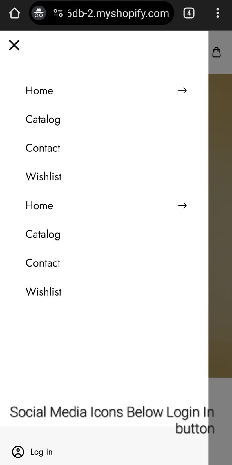
Bro if you don’t mind would you help me with the CSS of this mobile menu? You can see in the image below that there is too much white space below the wishlist button and adding more pages pushes the login icon and the social media icons below the page, where they aren’t visible anymore, Can you please help me so that the login icon and social media icons are always visible even when pages in the menu are so much that they touch the login icon. Obviously there won’t be a lot of pages but just saying for reference. I just don’t want the login icon and social media icons to push down. Thanks!
Thanks, I tried the code but now the menu looks a bit off, as I don’t want to reduce the size of the menu drawer. I want it to be full page. Could this be applied in a way that the menu drawer is full page while social media icons are visible too? Thank you!


