Hi all.
Is it possible to remove the top navigation… center the logo then on left hand corner where the logo was putting a drop down for the navigation? I want the desktop view to be the same as the mobile view in the header. I hope this makes sense. In my mind it does but not sure it will to any of you lol.
My website is www.pennsylvaniaparks.org
Thanks!
Hi there @Justin34 . I believe I understand what you’re describing and I’m happy to help you out. Your website looks great by the way! Do you mind if I ask why you prefer the mobile view for desktop?
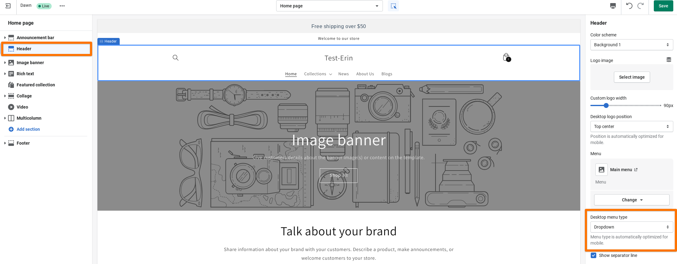
Using Dawn it is possible to center your logo in your theme editor. You can get there by going to Online store > Themes > Customize (next to Dawn). From there, select Header to open the settings for that section and you should see the Desktop logo position setting which you can change to Top Center. Doing this will center your logo like in the screenshot below.
That being said, using Dawn it’s not currently possible to set up your desktop menu as a menu drawer/hamburger menu like on the mobile view. You can see the Desktop menu type options in the Header settings in your theme editor. For Dawn, and all of our free themes, the only options at the moment are “Dropdown” or “Mega menu” which will both display along your header rather than to the left. However, there are third party themes that I’ve seen with this option built in. Off the top of my head, I know that the theme Impulse by Archetype Themes is one example of a theme with the menu drawer option built into the theme editor.
It may still be possible to change the menu type by editing your theme’s code. If you would like to go that route and you’re not comfortable coding yourself, I’d recommend hiring a Shopify Expert to assist you. You can hire one through this page here or learn more about them on this page here.
Please let me know if you have any questions!