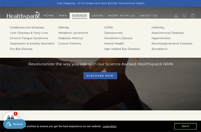
Hello . So I created a mega-menu. On my store Healthspanx.org (Password: Spanx ), you can see the science page in the navigation. (Screenshot below) .
Hovering the mouse over it covers the entire video. As a result, it needs to be made narrower. must not cover the entire video.
Also, other items in the navigation open from top to bottom, but the science page opens from bottom to top
My store builds on Impulse theme.
Store URL: Healthspanx.org
Password: Spanx
I would greatly appreciate any help you can provide 
Hey,
Go to Online Store > theme > actions > edit code.
Open assets folder > theme.css.
Copy and paste this code at the bottom of the file. Save.
.text-center .megamenu .grid {
  text-align: center;
  display: flex;
  gap: 0px;
}

.text-center .megamenu .grid .grid__item {
  display: grid;
  grid-template-columns: 1fr 1fr;
}

.text-center .megamenu .grid .grid__item {
  display: grid;
  grid-template-columns: 1fr 1fr;
  column-gap: 25px;
  min-width: 50%;
}
.text-center .megamenu .grid .grid__item div {
  display: grid;
  grid-template-columns: 1fr 1fr;
  column-gap: 30px;
}

.megamenu .site-nav__dropdown-link:not(.site-nav__dropdown-link--top-level) {
  width: max-content;
}

@media only screen and (min-width: 1025px) {
  .grid {
    width: 100%;
  }
}

@media only screen and (max-width: 1120px) {
  .text-center .megamenu .grid .grid__item {
    grid-template-columns: 1fr;
  }
}
Result:
Hope this helps!
1 Like
Thank you so much @dannyelo . You made my day. Its work 
But the menu still opens from bottom to top .
Is there a way to make it open from Top to bottom?
I would greatly appreciate any help 
You are welcome!
About the animation, I’m not sure where is coming from. It may be animated with javascript.
1 Like
Oh okay @dannyelo Thank you so much for the help . Have a great day 
1 Like
![]()

