Hey All,
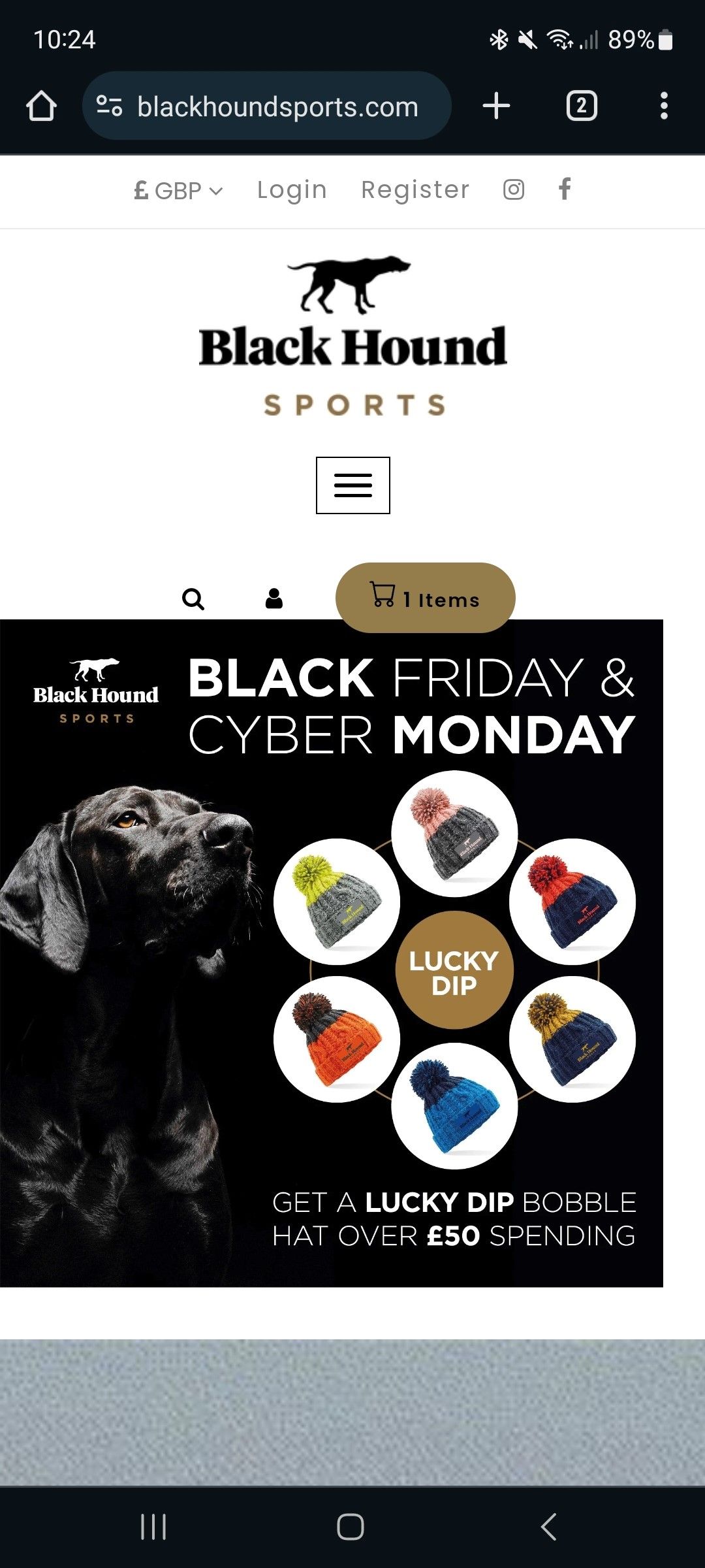
How can I make my banner not be impacted by different screen sizes and just fit all desktop aspect ratios so that the text is not cut off?
What HTML could I add to the custom section to change this?
See the site here: www.blackhoundsports.com
As you may be able to see the banner section can be cut off like the below:
Any ideas or further explanation let me know what I can do?
Thank you.
1 Like
You can do that by adding this additional code
background-size: contain;
Hi @drewhound
Check this one.
- From your Shopify admin dashboard, click on “Online Store” and then “Themes”
- Find the theme that you want to edit and click on “Actions” and then “Edit code”.
- In the “theme. Liquid” file. Find the tag and paste the code below before the tag.
Please don’t forget to Like and Mark Solution to the post that helped you. Thanks!
Problem is this breaks the mobile versions formatting as they are set for different screen sizes?
Any ideas?
1 Like
Yes, I know what you mean that is why I’m giving you the code so it will stop breaking in other screen size.
Please don’t forget to Like and Mark Solution to the post that helped you. Thanks!
Thank you yes it does fix the desktop version but then adds this to the mobile?
The right boarder on the side.
Any Ideas?