A user seeks to reposition the “buy now” button higher on mobile view to match their desktop layout, as there’s currently a large gap pushing it down. They’re using the Refresh theme.
Solution provided:
Add custom CSS code to the theme.liquid file (above the </body> tag)
The code targets mobile view to adjust button positioning
Current status:
The initial fix successfully moved the button up
However, two new issues emerged:
Significant white space remains between an image with text below it and another element
The buy now button now appears somewhat oversized
The discussion remains open as the user needs additional help fine-tuning the spacing and button size on mobile.
Summarized with AI on November 19.
AI used: claude-sonnet-4-5-20250929.
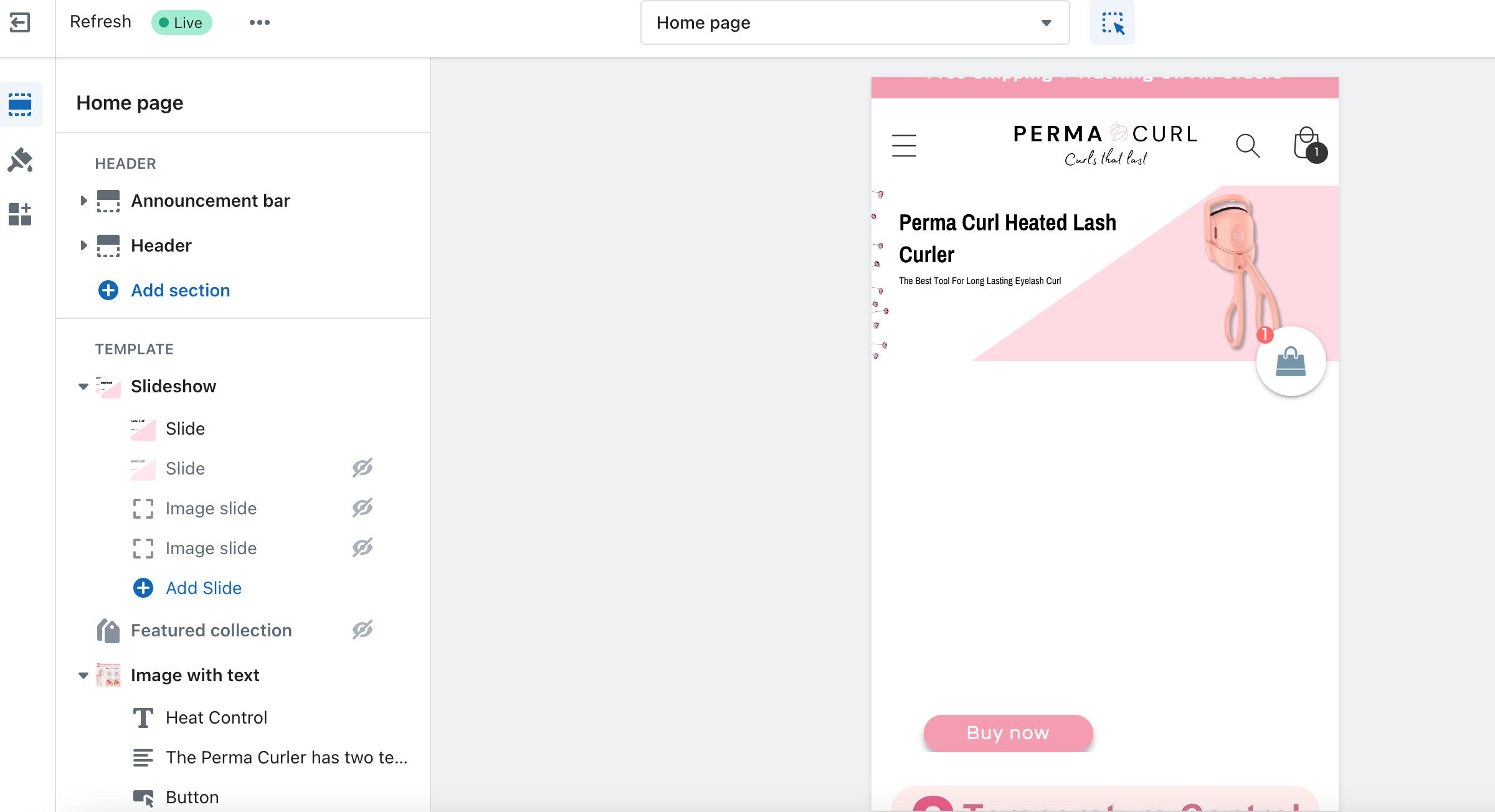
Hello, I want to move my buy now button up higher on my mobile view to match my desktop view. The desktop view is perfect and just how i want it, but on mobile it is very far down on the screen with a big gap. I am using the refresh theme.
hey this worked, thank you. The only thing now is there still is a big space of white between the slide and the image with text below it, plus the buy now button is a bit large. How do I fix these two parts?