How can I move the cart banner closer to the currency converter? I am looking to move it a little bit so that it looks better and clean.
Topic summary
A user needed to reposition the cart icon in the Dawn theme to create better spacing from the currency converter on their Shopify store (toiletbrush.no).
Desktop Solution:
- Add CSS code to base.css, style.css, or theme.css in the Assets folder
- Applied
margin-left: -10px !important;to.doubly-wrapperclass - Successfully moved the cart icon closer to the currency converter
Mobile Issue & Fix:
- The desktop solution caused the cart icon and currency converter to overlap on mobile devices
- Resolved by adding a media query targeting screens max-width 749px
- Applied
margin-right: 0pxto.header__icon--cartand set.doubly-wrappermargin-top to 0px
Outcome:
Both desktop and mobile layouts now display properly with appropriate spacing. The issue was fully resolved through CSS customizations targeting different screen sizes.


1 Like
Hi @Onlinetrap
Try this one.
- From your Shopify admin dashboard, click on “Online Store” and then “Themes”.
- Find the theme that you want to edit and click on “Actions” and then “Edit code”.
- In the “Assets” folder, click on “base.css, style.css or theme.css” file, depending on which file your theme uses to store its CSS styles. At the bottom of the file, add the following CSS code:
.doubly-wrapper {
    margin-left: -10px !important;
}
- And Save.
- Result:

1 Like
You made my day!  Thanks a lot, it worked!
1 Like
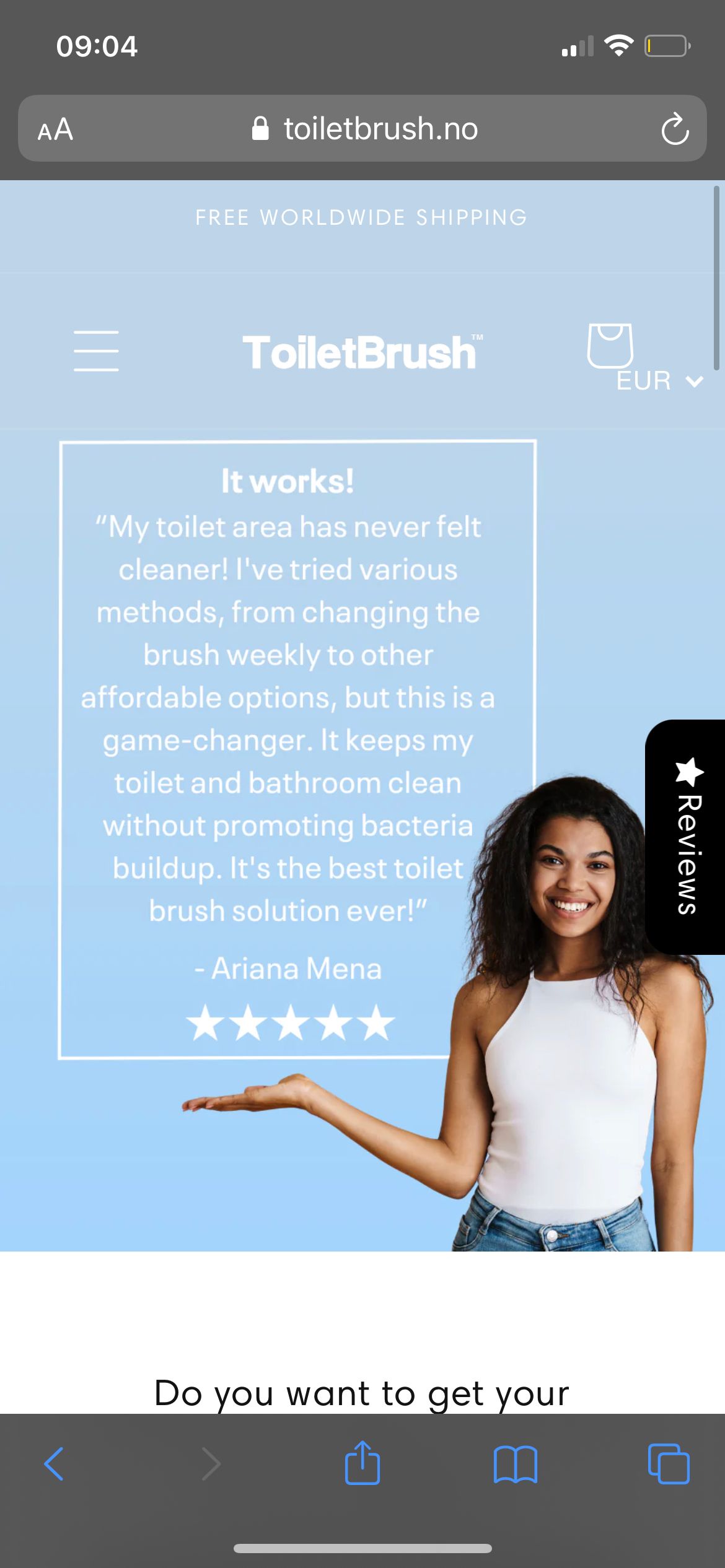
Buuut, I have an issue on mobile, where the cart icon and currency converter almost are on top of each other, is there a way to move the cart banner little bit to the left, but only on mobile and not on desktop? Because it looks good on a desktop after using your code
(It was looking like this on mobile view prior to adding your code, so your code worked perfectly).
Here is how it looks on mobile view now:
1 Like
Try this one same instruction.
@media only screen and (max-width: 749px){
.doubly-wrapper {
    margin-top: 0px !important;
}
.header__icon--cart {
    margin-right: 0px;
}
}
And save.
Result:

1 Like
It worked! Thanks a lot